Fun fact: studies show that traders who track and visualize their progress are up to 40% more consistent in reaching their goals.
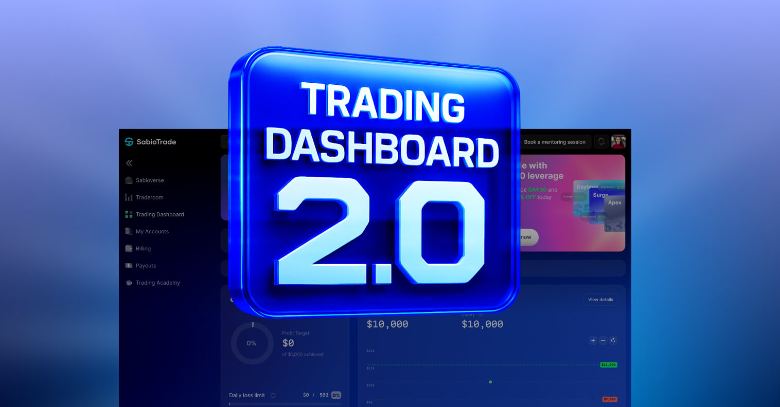
That’s why we rebuilt the Sabio Trading Dashboard — to make tracking your trading as natural (and motivating) as possible. We’re really proud of how it turned out and hope you’ll enjoy it big time!
The new dashboard is clean, easy to use, and gives you a clear picture of where you stand. Think of it as your personal trading command center that we built to make your life comfier.
Join us on the welcome tour to the Sabio Dashboard 2.0.
New Design and Navigation
When you first log in, you’ll notice the new design. We went for a modern, minimalistic design that feels friendly from the start.
And to make sure you don’t get lost, we added a guided onboarding flow. Step by step, it shows you around the main features.
For your convenience, we structured your data into clear widgets — each one representing a specific part of your trading progress. Here’s the lineup:
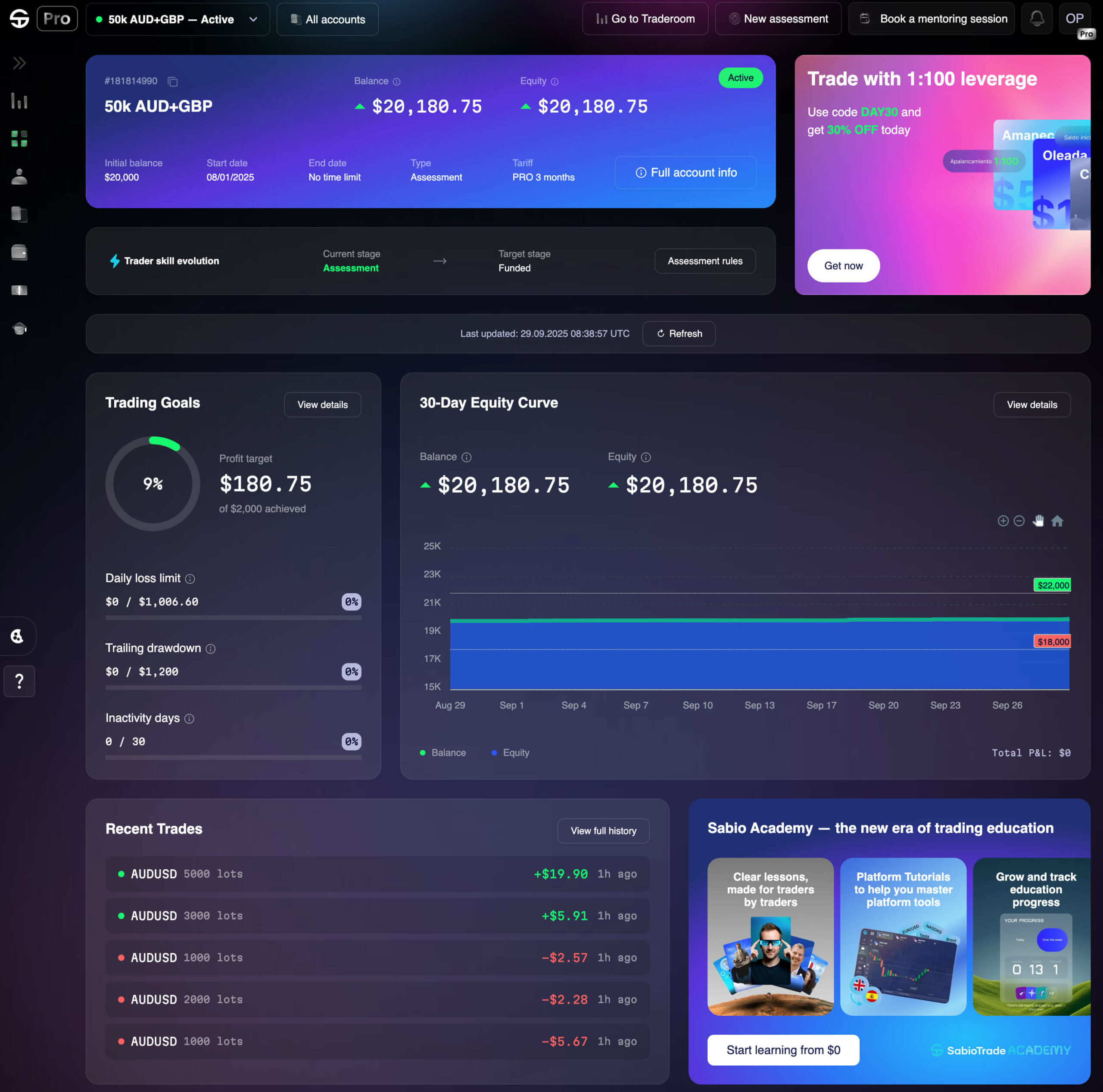
Account Dropdown
This is the “front desk receptionist” of the dashboard. All your accounts live here, and color codes show who’s healthy, who’s sick, and who needs attention.

Got more than one account with Sabio? This section lets you jump between them instantly — just one click and you’re there.
Once you’re in your account, the first thing you’ll see is the Account Widget showing your tariff details, ID, balance, and current status — all laid out at a glance.
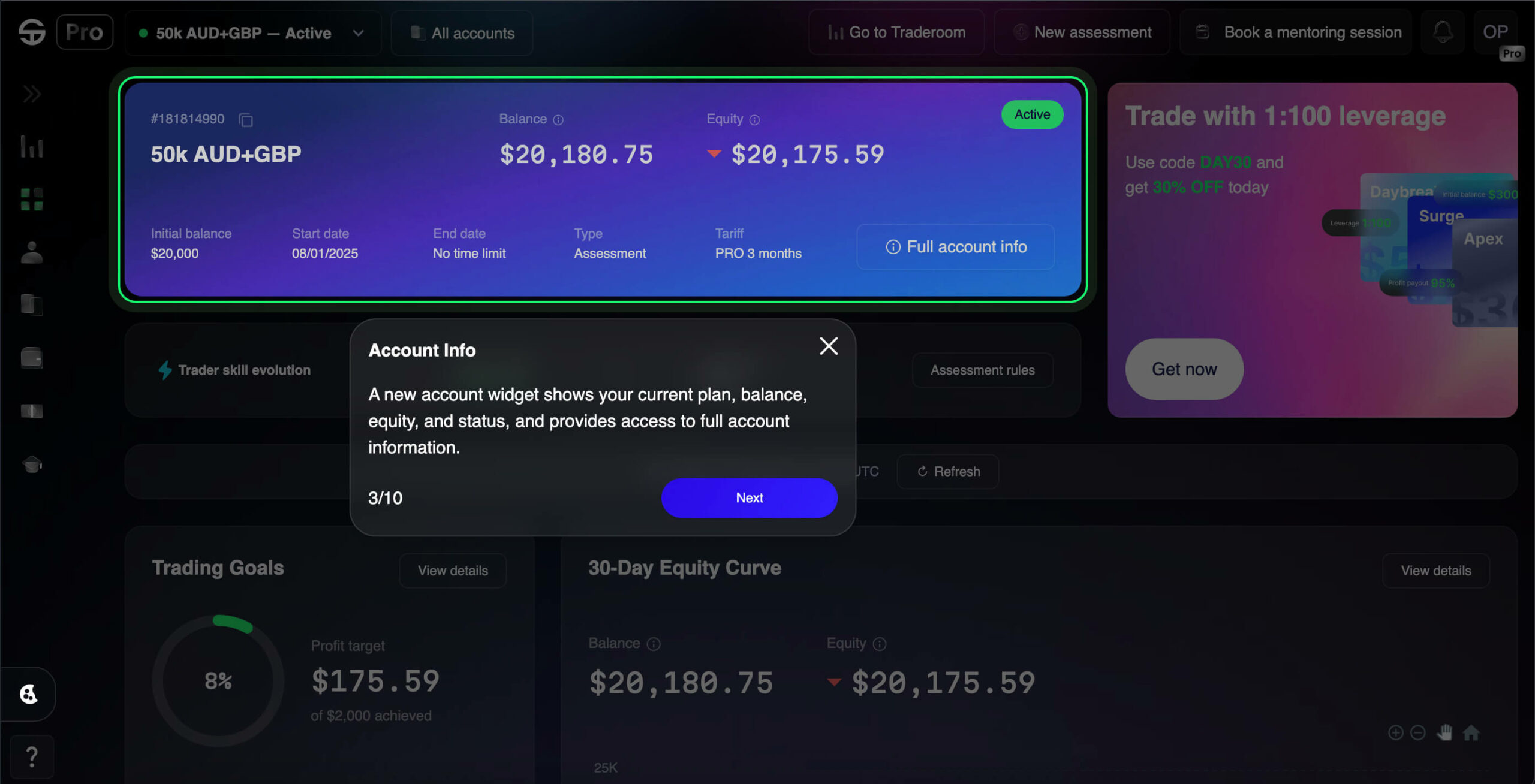
If you need more details, click the “Full account info” button.
The Trader Skill Evolution widget shows exactly where you are on your trading journey and how close you are to reaching the next level.
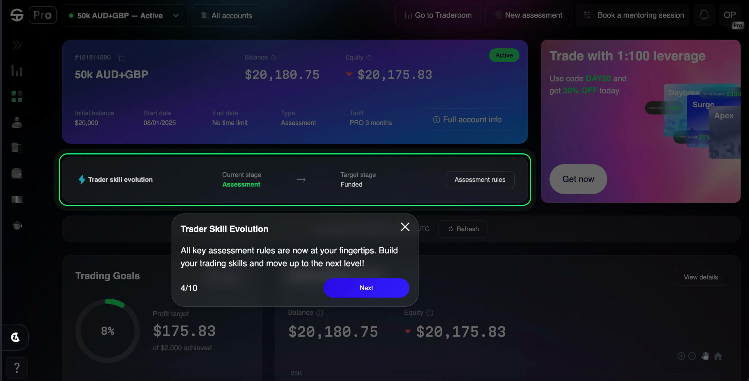
Keep forgetting the assessment rules? This widget has a built-in rules button, so they’re always right where you need them.
Profit Target & Risk Chart
Every trader needs a reality check — and that’s exactly what this widget does. It’s your progress bar for goals and limits, all visualized in one place.
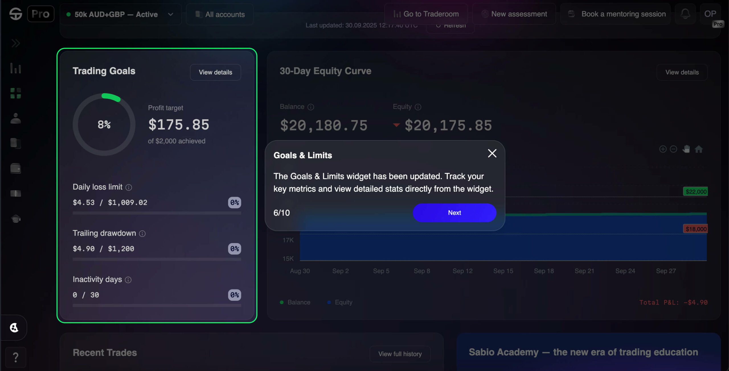
You’ll see right away how close you are to your profit target. Right below that, the widget tracks your daily loss limit, trailing drawdown, and inactivity days. Each metric is paired with a percentage, so you instantly know whether you’re safe, close to the edge, or already breaking the rules.
If the Profit & Risk Chart is your coach, the Equity Widget is your diary. It keeps a detailed record of how your account has been performing over time.
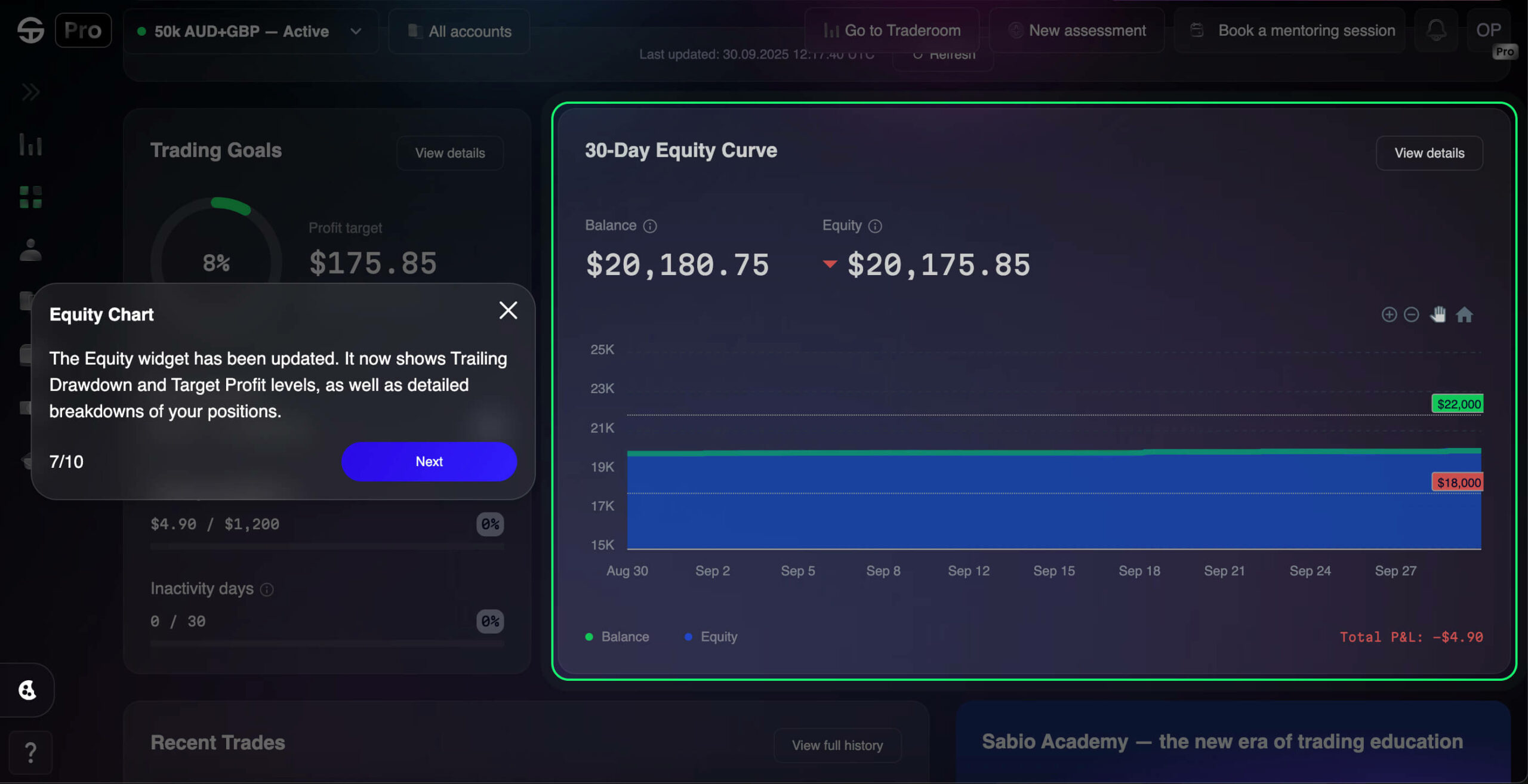
The chart displays your balance and equity side by side across 30 days, highlighting changes in P&L and showing exactly where gains or losses happened. Hovering over any point reveals the numbers for that day — balance, equity, and profit/loss.
This widget makes it easy to spot patterns in your trading quality: where you managed risk well, where volatility hit hard, and where your strategy paid off.
In case you didn’t know, we have a Sabio Academy where we teach traders everything from the basics to advanced strategies. The Suggestions Widget pulls that right into your dashboard.
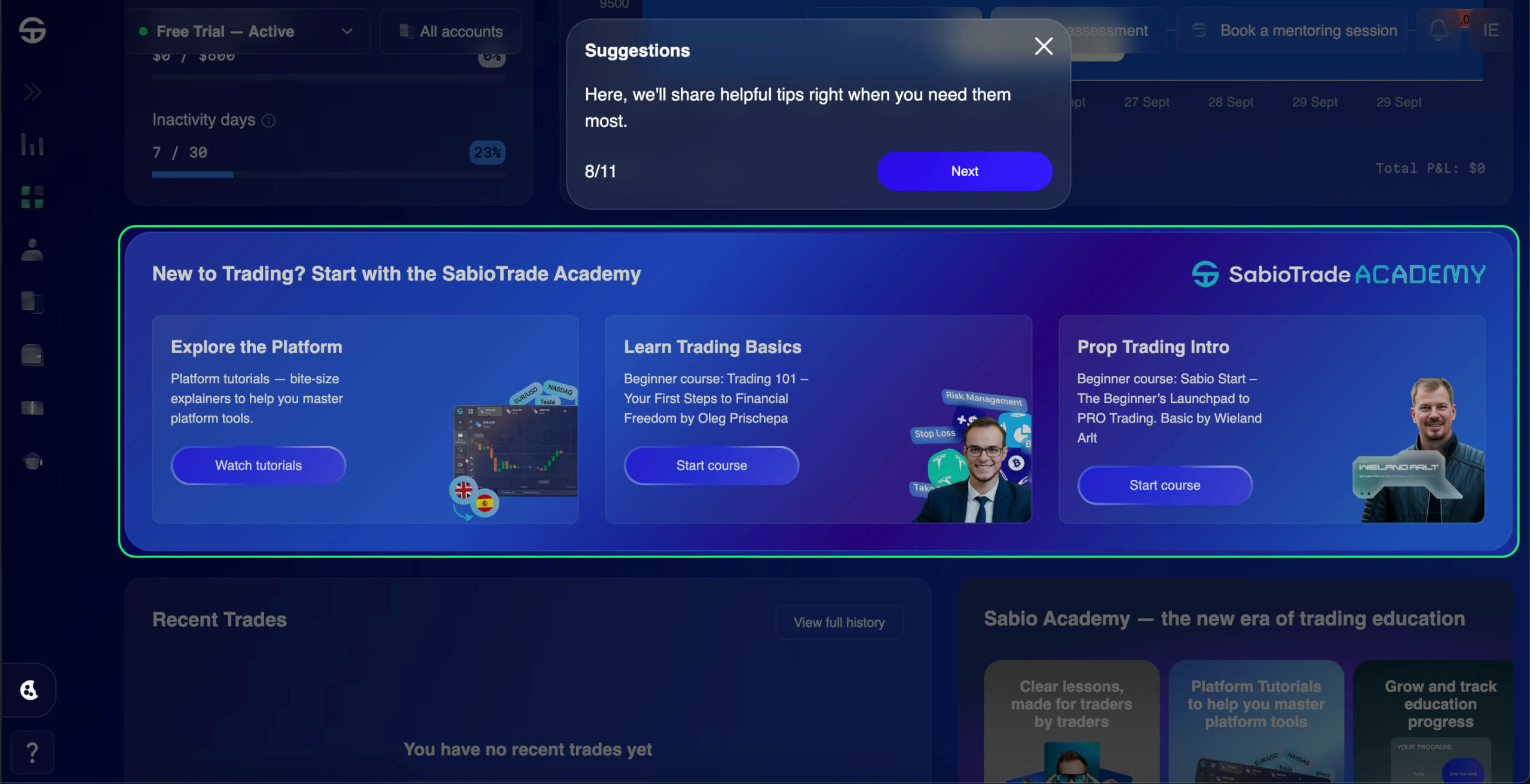
Depending on your trading stage, you’ll see tailored recommendations — like joining our Telegram channel for signals, watching webinars, or starting a course that matches your skill level.
It’s a direct link between your daily trading and the knowledge you need to keep improving — all in one place.
Your last moves shouldn’t be lost — and with the Recent Trades widget, they never are.
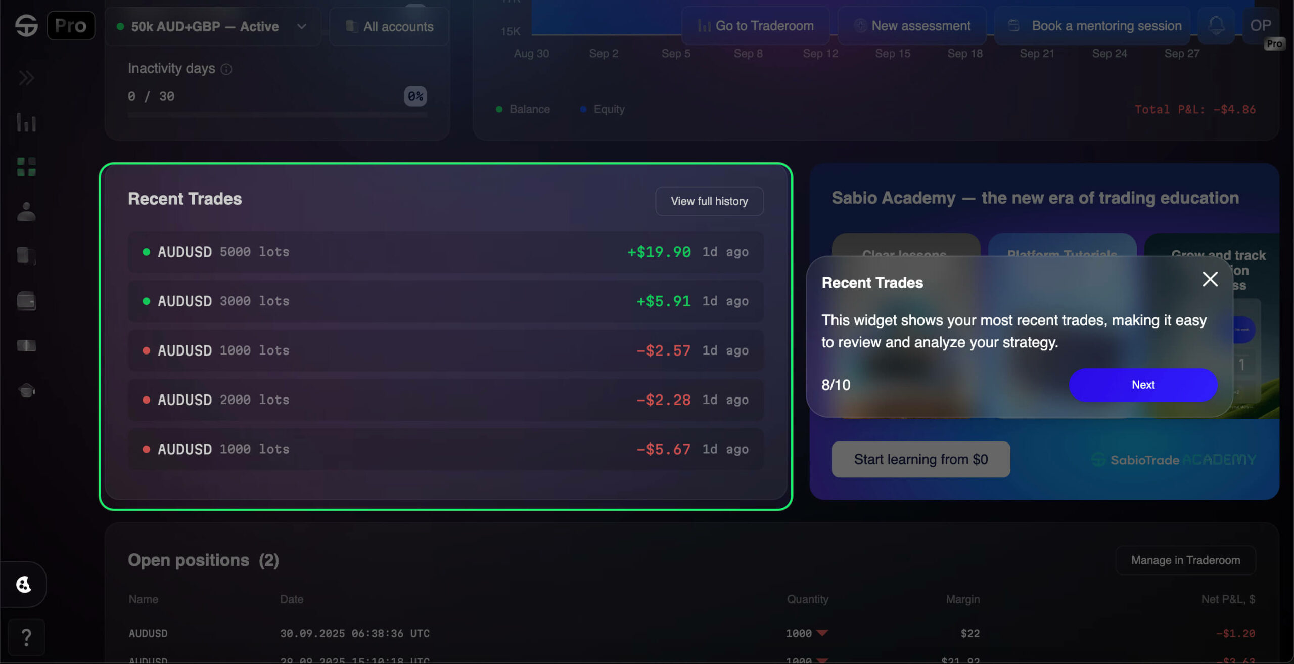
Here you can instantly see which assets you traded, the lot size, the result (profit or loss), and how long ago it happened. Each trade is color-coded for clarity, so you spot wins and losses at a glance.
Want to dig deeper? A direct link to your full Traderoom history is just one click away, so you can review, analyze, and learn from your recent activity without losing time.
Here, you’ll find a live list of every open trade you’re running right now.
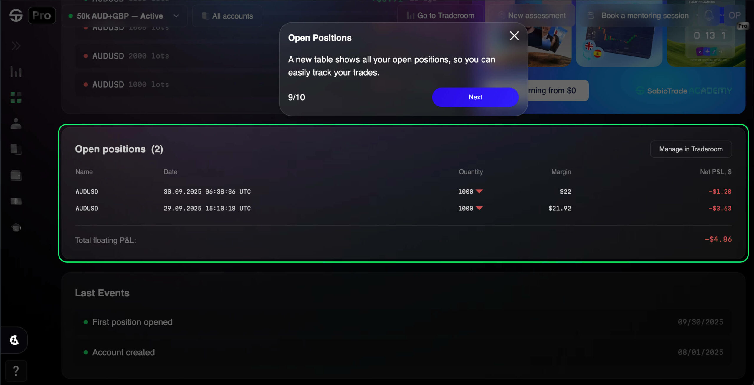
You’ll see the instrument name, entry price, quantity, margin, and current P&L, all laid out in one view. The numbers update in real time, so you can immediately spot which positions are in the green and which need attention.
If the market suddenly shifts, jump straight into Traderoom from here to adjust or close a trade on the spot.
The Last Events widget works like a personal timeline of your account, recording key milestones such as when your account was created, your very first trade, and every important step after that.
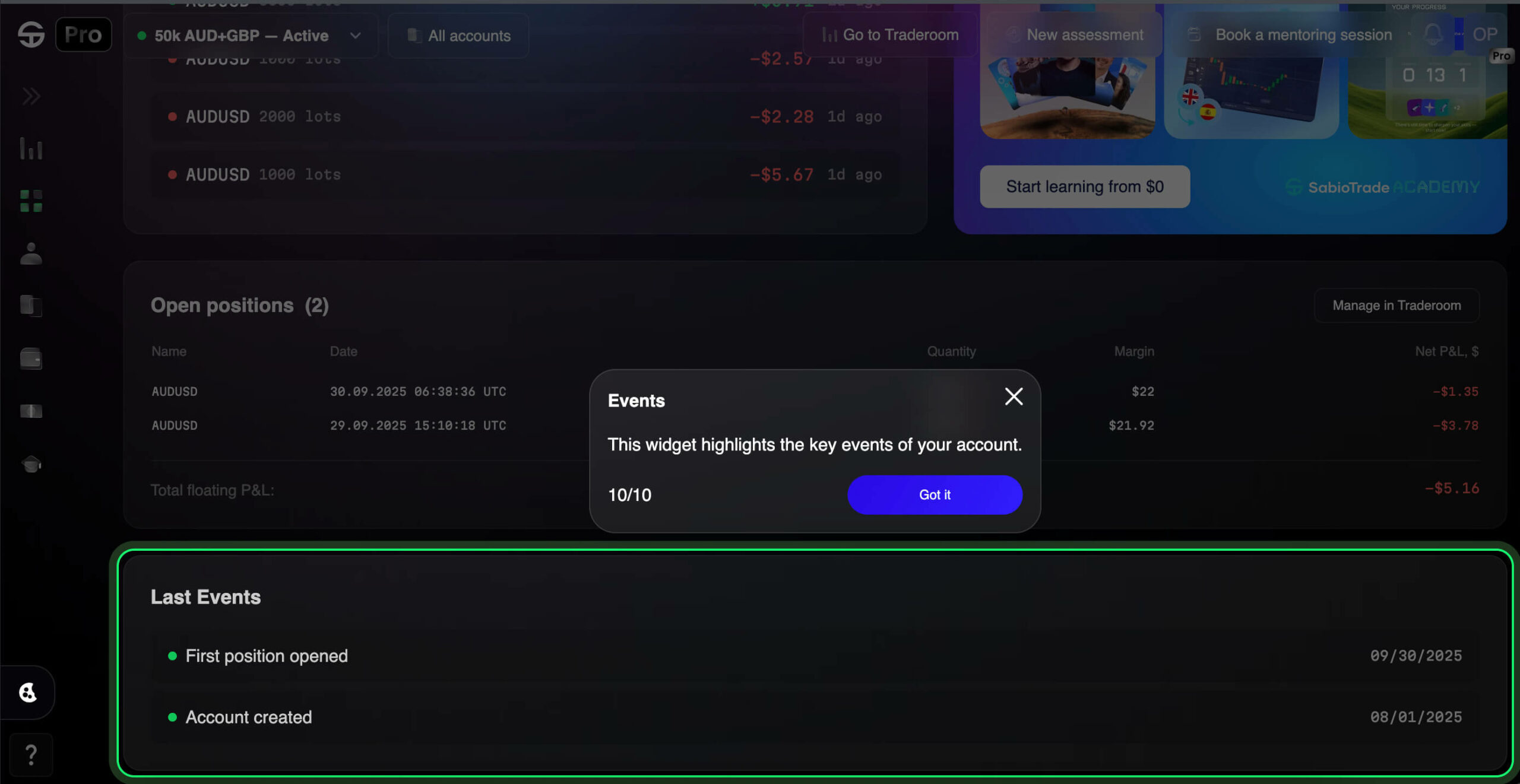
You’ll always find it at the bottom of your dashboard, keeping a log so you never lose track of what’s been happening in your trading journey.
Why Is The Sabio Dashboard 2.0 Actually Awesome?
Short answer: because it makes your trading life much easier. Longer answer:
- Control — know exactly where you stand.
- Time-saving — everything you need in one window, no tab-hopping.
- Simplicity — clean, intuitive, and not trying to confuse you.
- Growth — trading + learning baked into the same workflow.
At the end of the day, the dashboard isn’t just a tool — it’s your accountability partner, keeping you focused, efficient, and always moving forward.
Final Thoughts
The new dashboard is built to give you comfort, clarity, and efficiency. It’s not just prettier — it’s a smarter way to trade, track, and grow.
With everything in one place, you’ll spend less time searching and more time improving. That means better focus, better trading, and better results.
We hope you’ll love our new dash as much as we do. Happy trading!