The Hammer Candlestick Pattern and How to Use It in Trading
The Hammer Pattern is among the most well-known candlestick patterns. It is used by traders and investors alike to predict potential trend reversals in financial markets and enhance their trading decisions.
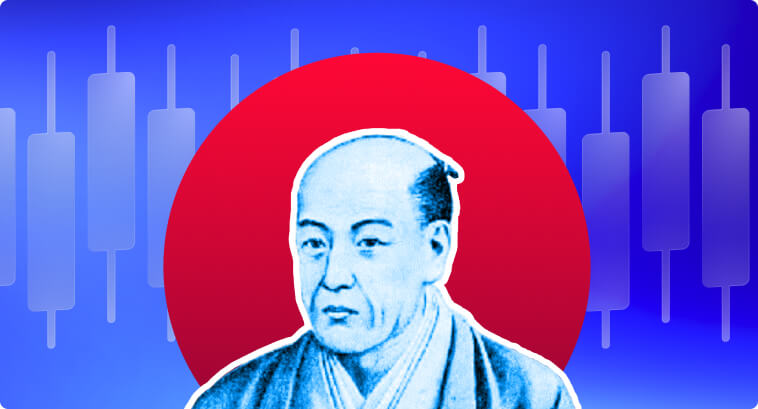
The Hammer Pattern is a reversal signal pattern that appears in Candlestick Chart Analysis. Invented by a prominent rice trader in Osaka, Japan, Candlestick charts have been studied and utilized since the 1700s. This method of price analysis is deeply respected and widely adopted by traders, especially because it makes it easy and straightforward to visualize trends and identify whether bulls or bears are in control of the market. It also helps traders define entry and exit points whenever they identify that bearish momentum is weakening, bullish sentiment is starting to dominate, and vice versa.
In this article, we will expand upon one of the most popular figure formations people use to identify trend reversals. If you’re also interested in deepening your understanding of price charts, you can read our article teaching you how to read Forex charts.
Understanding Hammer Candlesticks
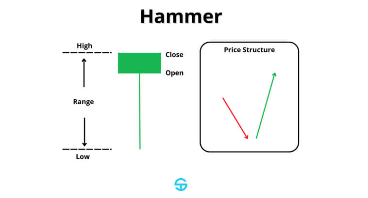
The Hammer candlestick formation is a candlestick pattern that consists of one single candlestick. It has specific characteristics that make it extremely easy to recognize it on price charts, such as:
- Body: The body is tiny and located near the top of the candlestick’s entire range. It suggests a small difference between the opening and closing prices.
- Lower Shadow: The lower shadow must be at least twice the size of the body. This feature suggests that, although the sell-side has been able to push prices lower, the market strongly rejected deeper price levels during the session.
- Upper Shadow: Ideally, a textbook example would have no upper shadow, since that would reinforce the dominance of the bullish recovery. But some Hammer candles can have a minor upper shadow.
In order to have a valid and reliable hammer signal, the body should remain small. A large body diminishes the reversal implication of the figure. A lengthy lower shadow is highly important because that’s what tells us that bears have lost the dominance they have been exercising on bulls. The absence of an upper shadow is also important due to it reinforcing that bulls didn’t face any significant resistance while pushing prices higher.
Hammer candlesticks can be either green/white or red/black. Its color does not negate its significance. What matters the most is how this figure reflects market psychology and where it appears on the chart.
The Psychology Behind The Hammer Candlestick Pattern
The Hammer pattern, just like any other candlestick, imprints the constant struggle between buyers and sellers within a time period. The Hammer pattern, on the other hand, has a very specific translation of price movements and market sentiment.
At an initial moment, bears kept pushing prices lower, confident that the security in question should be priced lower than the opening price. However, at a certain point, bulls are able to counteract this initial move, shooting the price back up and ending the trading session close to or above the initial price. This price behavior leaves a long lower shadow behind, which makes it easy to spot a hammer candlestick on price charts.
This price action reflects a dramatic reversal in market sentiment. It shows that, even though bearish momentum was dominant, bulls were able to take over and break any resistance to push prices higher. For this reason, the classic hammer pattern is known as a bullish reversal pattern.
Understanding the dynamics behind candlestick formations is extremely important to interpreting market sentiment and knowing why prices move a certain way. This knowledge is highly relevant for trading strategies, including Forex trading strategies.
Using Hammer Candlesticks: Different Types of Candle Patterns
There are several types of candlestick figures that have a hammer-like shape. Some of them indicate a bullish reversal, while others indicate a bearish reversal. Down below, we will take a look at some of the key features of these patterns:
Classic Bullish Hammer
The classic Hammer candlestick is a bullish pattern that appears after a downtrend. It signals a potential reversal to the upside. It is characterized by a small body at the top and a long lower shadow. It can have a total absence of an upper shadow or a very small one.
Additional technical indicators can help you assess the strength and reliability of the pattern. It is only recommended to interpret a candle like this as a Hammer pattern when it appears during a downtrend. It has a stronger potential as a reversal indicator when it appears around significant support zones or when an oscillator like the RSI points out that prices are underneath oversold territory, where the selling pressure tends to exhaust. If the following candle closes above the hammer’s body, then that confirms the bullish reversal.
Although some sources say that it has a 50-65% effectiveness rate in predicting bullish reversals, most people consider it more of a warning sign to look for further confirmation instead of a definitive buy signal on its own.
Inverted Hammer
The Inverted Hammer also appears during a downtrend and indicates a potential uptrend reversal. It has a tiny body at the bottom of the candlestick’s entire range, and it is accompanied by a long upper shadow. The long upper shadow indicates that, although bears have “won” the trading session, bulls have been able to push prices higher. Psychologically speaking, this could be a sign that the buy side is “testing the waters” and bearish strength is weakening.
Similar to the classic hammer pattern, the Inverted Hammer is more reliable when it appears around a strong support level. Prices under oversold conditions (RSI < 30) can also be used to indicate a larger potential for a reversal. If the following candle is bullish, we might have a strong confirmation that buyers have regained control over the market, serving as a possible entry point.
Some sources suggest that the Inverted Hammer has a lower reliability score compared to the classic Hammer, at around 50%. For this reason, confirmation is essential.
Hanging Man
The Hanging Man is a bearish hammer pattern that appears during an uptrend. It looks identical to the classic hammer, featuring a small body around the top and a long lower shadow.
The context of the Hanging Man candlestick pattern, however, is much different from that of the classic hammer. Its long lower shadow demonstrates a session that has been almost entirely dominated by sellers during a bullish trend. The lack of an upper shadow displays a lack of strength from the buy-side to push prices higher, leaving them the only option to try to hold the bearish pressure (which causes the long shadow underneath the candle’s body).
The most optimal scenario for this figure to precede a bearish reversal is at moments where it appears near a price level that has served as a resistance level before or at an all-time high. The RSI can also suggest whether prices are under overbought condition (RSI > 70), which serves as an additional point to consider when deciding to go short or not. If the following candles close below the Hangin Man’s low, that is a confirmation that a reversal has taken place.
Sources can differ on the Hanging Man’s effectiveness rate. There are even technical analysts who defend the idea that the Hanging Man is, in fact, a bullish continuation pattern instead of a bearish reversal, which is the case of Thomas N. Bulkowski, who even attributed a 59% effectiveness rate of the pattern as a bullish continuation pattern.
Shooting Star
The Shooting Star is one of the most easily recognizable patterns in technical analysis. It is a bearish reversal pattern that marks the end of an uptrend and resembles an Inverted Hammer. It features a tiny body near the bottom and a long lower shadow.
When talking about market dynamics, this candle imprints a scenario where sellers overwhelm buyers while they are trying to reach new highs, suggesting exhaustion of the buying force.
A Shooting Star is more reliable when it appears at price levels that served as resistance before. It is also more reliable when RSI is above 70, indicating an overbought condition. If the following candles close below the Shooting Star’s low, that is a good sign that a bearish reversal is on course.
According to some sources, it is considered a moderately reliable pattern, with an effectiveness rate varying from 55% to 65%.
How to Identify Hammer Candles
A step-by-step method to identify the Hammer Pattern involves:
- Analyze the Trend: The classic Hammer and Inverted Hammer must appear after a significant price decline. On the other hand, the Hanging Man and the Shooting Star should occur after a substantial price rise.
- Analyze Candlestick Proportions: As a thumb of rule, hammers should have a small body and long shadows, either upper or lower. In the case of the Hammer Pattern, it is ideal that the lower shadow is at least twice the size of its body.
- Analyze Confirmation Signals: A Classic Hammer followed by a strong bullish candle is a great indication that bulls have taken full control over price amid a downtrend.
- Analyze Trading Volume: An increase in trading volume during the formation of the candle indicates that there is interest among market participants. If a pattern forms on a price chart without a substantial volume, that is a sign that there is low interest for that asset at current price levels, so price action is erratic.
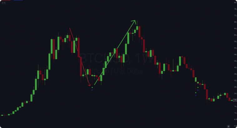
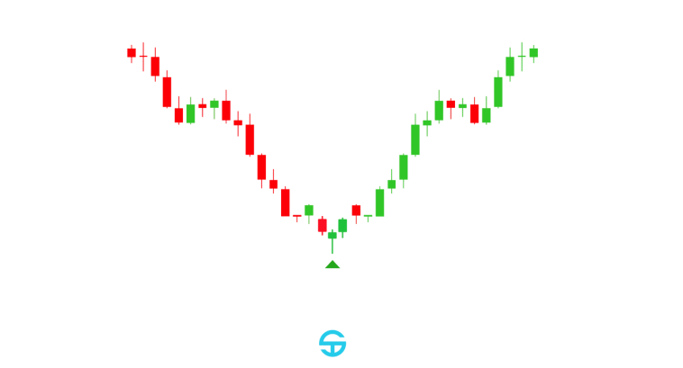
The image above depicts a Hammer candlestick appearing on the weekly chart of Bitcoin. Notice how it has a very small body on top, with prices closing at the highest peak of the trading period, and a large lower shadow. The pattern appears after weeks of a bearish market. A bullish momentum starts building right after the appearance of the pattern, as prices don’t approach the Hammer’s low for the next weeks, until a moment where a significant uptrend starts 4 to 5 weeks after the Hammer pattern first appears.
Luckily, there are several tools on platforms like TradingView that you can use to screen for hammers and other patterns. In the chart above, I am using the indicator “Hammers & Stars Candle [2022]” by the user LuxTradeVenture.
Even though these indicators can help, remember that context matters. Use additional indicators to visualize the dominant trend (e.g., a combination of shorter and longer moving averages), volume, evaluate the formation of the candlestick and where it appeared on the chart, etc. You can see how the screener identified two other Hammers later on, but none of them resulted in an uptrend right away.
Beware to not mistake Hammers for similar patterns, like the Doji or Spinning Tops. Pay close attention to the shadow-to-body ratio and market context.
Hammer Candlestick Trading: Key Trading Strategies and Examples
Let’s examine some scenarios to evaluate how to trade Hammers and similar patterns on a daily basis.
Successful Trades
Overall, candlestick patterns tend to be more reliable on longer timeframes. Intraday charts come with a lot of noise, and patterns have a tendency to fail when they occur in shorter timeframes.
Evaluating patterns on their own is also an erratic move. For this reason, the examples below will all contain a confluence of pattern trading with additional indicators or techniques.
Moderna, Inc. (MRNA) – 1wk
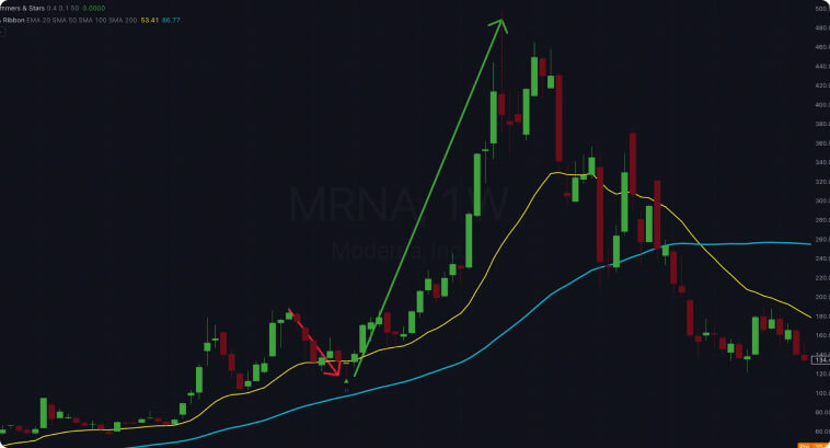
- Strategy Breakdown: We’re looking at a setup that uses a combination of moving averages: a 20-period EMA for shorter-term trends and a 50-period SMA for longer-term context. The 20-EMA above the 50-SMA tells us that the overall market trend is bullish, but some short-term bearish pressure pushed the price below the 20-EMA. The appearance of a hammer pattern between the 20-EMA and the 50-SMA suggests that buyers are stepping back in, and the pullback may be ending. This combination of a pullback to the longer-term SMA and the bullish hammer pattern creates a buying opportunity for swing traders.
- Entry Strategy: A conservative approach for this scenario would be to enter a long position after the price closes above the Hammer’s high–which happened the following week. This confirms that bulls are gaining traction amidst the short-term downtrend.
- Stop Loss: A stop-loss order could be successfully placed below the Hammer’s low.
- Take-Profit: Several methods can be employed for defining a take-profit level. It could be the last peak, where the short-term bearish trend started, or even Fibonacci extension levels.
The key here is how a confluence of moving averages is able to give you long-term market context and identify price levels where demand can surge because market participants may believe that the asset is now “cheap” (i.e., prices in between shorter and longer moving averages).
Bradesco (BBDC4) – 1d
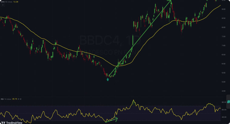
- Strategy Breakdown: In this scenario, we have a 50-period EMA to define the mid-term trend. Prices consistently closing below the 50-EMA indicates that we have a mid-term bearish trend. Using the RSI for further analysis, we can see that prices have reached oversold conditions and that there is a divergence between price and indicator. Prices were making lower lows from August to January, but the RSI was making higher lows. When a candle resembling the Hammer pattern appears at the bottom, far away from the 50-EMA, and prices refuse to reach lower zones, we have a warning signal that bullish momentum might be awakening.
- Entry Strategy: A very conservative entry point would be after the price crosses and closes above the 50-EMA. This is the main confirmation that buyers have taken control and overpowered the bearish mid-term trend defined by the moving average. A more aggressive entry point would be at the Hammer’s high, considering the RSI divergence and oversold levels.
- Stop Loss: A stop-loss order could be placed below the Hammer’s low.
- Take-Profit: Similar to the previous example, take-profit levels could be set at previous resistance levels, Fibonacci extensions, or a trailing stop-loss strategy.
The key idea here is how the confluence of the 50-period EMA, the Hammer formation, and the RSI signals (oversold levels and bullish divergence) can give you enough evidence that demand is gaining force.
Unsuccessful Trades
For unsuccessful trades, we are going to take a look at some examples where Hammers and similar patterns show up in trickier scenarios. Let’s start by taking a look at an Intraday example.
Gold Futures (GC1!) – 30m
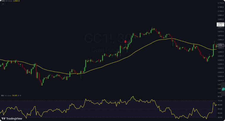
- Strategy Breakdown: In this example, we have a scenario where a Shooting Star appears during an uptrend, away from a 50-EMA, and at a region where RSI points towards overbought conditions. Right after the Shooting Star, we have a confirmation candle that showed bearish strength and closed below the Shooting Star’s low. However, it was a false signal, and prices continued to move up. A convergence of signals pointed towards a bearish reversal, but it didn’t happen. In shorter timeframes, noises are more frequent than in longer timeframes, which is why there is a higher chance of losses.
- Entry Strategy: The fast-paced environment in intraday price action makes it harder to follow conservative approaches. Waiting for prices to cross below the 50-EMA would be impractical in day trading. Most traders would either go short as soon as the price broke down the Shooting Star’s low or at the closing price of the candle that closed below it.
- Stop-Loss: A stop-loss order would be placed slightly above the Shooting Star high, which was triggered in the second candle that came after it, leading to a losing trade.
- Take-Profit: Take-profit levels could be defined at the 50-EMA, the previous low, or Fibonacci extension levels. In day trading, many traders opt for a trailing stop-loss system.
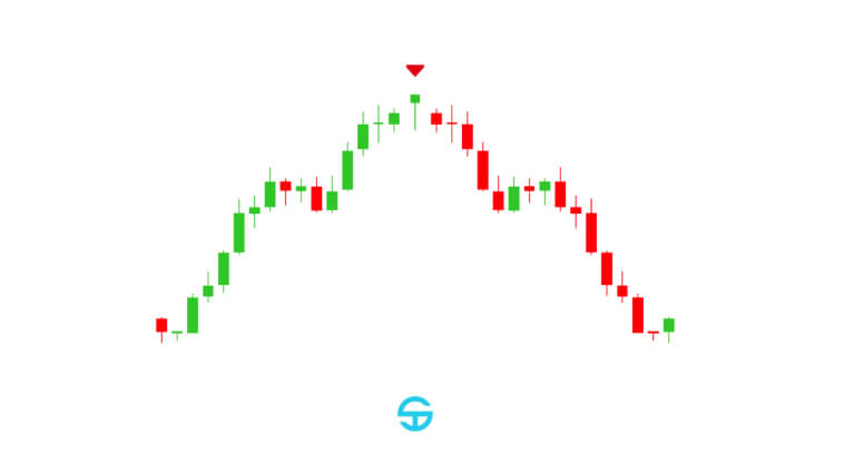
S&P Index Cash CFD (SP500) – 1wk
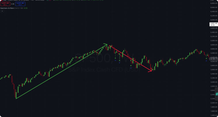
- Strategy Breakdown: What if you rely solely on a Hammer Pattern screener and ditch other indicators and techniques? The image above shows why that is a bad strategy. In the short term, we can draw an uptrend and the start of what looks like a pullback. There are three hammer formations in this pullback leg. None of the Hammers effectively caused prices to enter an uptrend in the mid-to-long term.
- Entry Strategy: The entry strategy could be at the Hammers’ high, meaning every Hammer in the image would trigger an entry. More conservative approaches would wait for the following candle to close higher than the preceding Hammer, which, in this case, a long order would be triggered only in the first Hammer.
- Stop-Loss: A stop-loss order could be set at the Hammers’ low. Every single one of these Hammers would’ve triggered stop-losses in this setting.
- Take-Profit: Take-profit levels could be set at the previous peak, around 4,800, or at Fibonacci extension levels.
Combined Analysis
Depending solely on candlestick patterns is not a good idea, regardless of whether you are using longer or shorter timeframes to trade. Moving averages and trendlines can help assess the pattern’s reliability, depending on where it appears on a price chart. RSI and MACD are extremely helpful in assessing whether prices are under oversold or overbought conditions, which can trigger a surge in demand or supply.
Trading volume analysis should be employed in every technical analysis strategy, as volume conveys highly important information, such as market participation.
Common Mistakes
Some of the most common mistakes that can make Candlestick analysis highly ineffective include:
- Ignoring Trend Context: Patterns without a preceding trend are much less reliable.
- Lack of Confirmation: Acting on the Hammer pattern alone without further confirmation tends to lead to losing trades.
- Lack of Risk Management: Over-leveraging or ignoring stop-loss levels increases risk and may end up blowing your trading account.
Always wait for confirmation, use additional indicators, and maintain a strict risk management strategy. You can explore more about price action concepts and get more insights into analysis methods by reading about Smart Money Concepts vs. Price Action.
Conclusion
The Hammer pattern is one of the most recognizable and liked candlestick patterns for traders and investors alike. It is easy to spot and easy to interpret, which is why it is such a popular choice for those looking to capitalize on trend reversals.
A better approach to the Hammer pattern is to combine it with other indicators and strategies in technical analysis, such as moving averages, trendlines, RSI, and MACD, among others.
With continuous study and practice, you will be able to master the nuances to effectively trade the Hammer pattern and reach success in the long term.
Frequently Asked Questions (FAQ)
- Can a Hammer pattern occur in an uptrend?
- A classic Hammer is a reversal pattern that forms after a downtrend. Candlesticks that resemble a hammer in an uptrend are called “Hangin Man,” another type of pattern.
- What is the difference between a Hammer and a Hanging Man?
- The Hammer forms after a downtrend, indicating a bullish reversal sign, while the Hanging Man forms after an uptrend, indicating a bearish reversal.
- How reliable is the Hammer pattern?
- Its reliability varies according to different sources. However, it tends to be more reliable when confirmed by subsequent candlesticks and additional indicators.
- Should I rely solely on the Hammer pattern for trading?
- No, it is always better to use the Hammer patterns alongside other tools and strategies.
- What timeframe is best for trading the Hammer pattern?
- It works on any timeframe but is more reliable on longer timeframes, such as daily or weekly charts.