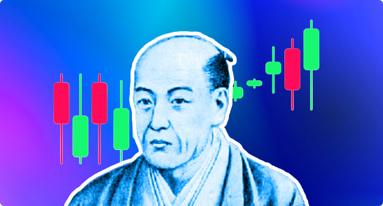
Bullish Candlestick Patterns
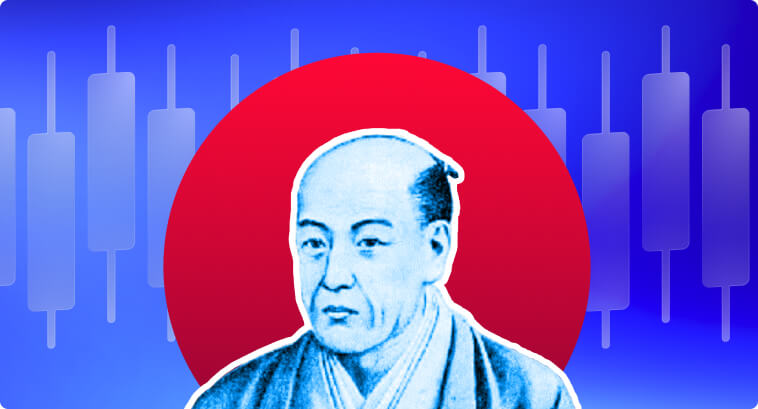
Candlestick patterns have been an important part of technical analysis for quite a long time. First developed in Japan during the 1700s by a rice trader called Honma Munehisa–also referred to as “The God of The Markets” by his contemporaries–Candlestick charts offer visual and intuitive insights into market trends and the psychology of traders.
Introduced to the West in the 1980s by Steve Nison, Candlesticks have become an indispensable tool for analyzing market sentiment and deepening perspective into future price action.
The main strength behind candlestick analysis is how adaptable it is to different types of markets. It is widely used in stocks, Forex, and commodities, which is why they’re still relevant to this day.
The roots of candlestick analysis trace back to 17th-century Japan. A rice merchant called Munehisa Homma–who traded in the Dojima Rice Exchange in Osaka–developed the candlestick chart while studying an approach to capture information from rice prices. With Candlesticks, he was able to gain an understanding of the emotions driving the market, allowing him to gain knowledge of price trends and predict future movements. Homma published his book, “The Fountain of Gold: The Three Monkey Record of Money,” in 1755, introducing the principles of candlestick charts and trading rules to the world. The creation of Candlestick was driven not only by the need to understand factors like supply and demand–which move prices up and down–but also by the emotions that influence the behavior of market participants, such as fear and greed.
By the 1980s, Steve Nison introduced the candlestick methodology to the Western world and integrated it with modern technical analysis tools–including dedicated computer software for market data analysis. This new form of using Candlesticks to observe price behavior was then incorporated into classic techniques like trendline analysis to enhance the reliability of patterns and signals in technical analysis. Even though the most recent technological advancements brought many changes to Finance and trading, the principles published by Homma way back in the 1700s still give us a valuable understanding of market dynamics.
Reading Candlestick Charts: The Basics
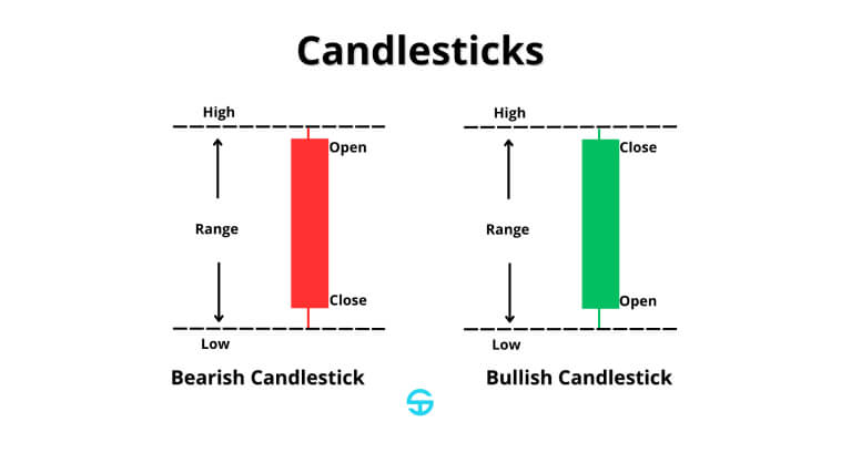
A candlestick has three main elements:
- Body: Illustrates the range between the opening and closing prices.
- Shadows: They reflect the highest and lowest prices of the period.
- Color: They are usually white or green for bullish candlesticks and black or red for bearish ones. They allow us to identify the direction of prices during the period.
Overall, a long body tends to indicate strong buying pressure or selling pressure. Long shadows reflect indecision in the market, where neither bulls nor bears could win the price battle during the period.
The Psychology Behind Bullish Candlestick Patterns and Trading Volume
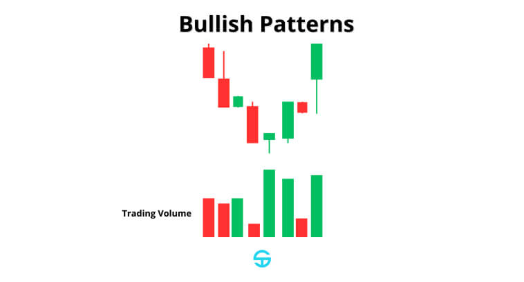
Bullish candlestick chart patterns are deeply rooted in market psychology and its dynamics. They imprint the shift from selling pressure to buying pressure. Even though bears have been able to successfully push prices down during the downtrend, whenever a bullish reversal pattern appears, it signals that bulls have started to gain enough momentum to drive prices back up. The bullish hammer pattern above demonstrates the moment that buyers overpower sellers despite the initial pressure downwards, which kickstarts an uptrend.
A good way to confirm the strength of a bullish pattern is by looking at the trading volume. A pattern becomes more reliable when it is accompanied by a higher-than-average trading volume. A larger volume indicates a larger participation of traders and investors behind the price action that formed that specific candle or pattern. A low volume, on the other hand, indicates that there isn’t much market participation to back the pattern up.
Bullish Reversal Candlestick Pattern
Bullish reversal candlestick patterns can be useful for anticipating trend reversal at the bottom of downtrends.
In a downtrend, bears/sellers are able to consistently pressure prices down, making the market reach lower lows. This happens until a point where a bullish candle appears, accompanied by a surge in trading volume. This is the perfect indication that bulls/buyers are now able to exercise more buying pressure than sellers, giving them enough strength to push prices back up, reaching peaks that are now higher than the previous high, giving rise to a new uptrend.
It is very favorable to identify the birth of a new trend early on and open a position in its direction. For this reason, we will dive into some of the most reliable patterns to indicate the start of a strong bullish trend, allowing us to open a long position early into the trend.
Single Candlestick Bullish Reversal Patterns
Hammer
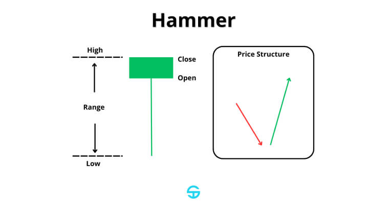
The hammer is a bullish candlestick pattern consisting of a candlestick with a small body at the upper end of the price range and a long lower shadow that is at least twice the length of its body. The hammer candlestick pattern is often formed at the bottom of a downtrend and effectively indicates a reversal to an uptrend.
Psychologically, the hammer represents a shift in sentiment during the trading session. For a moment, bears have full control of the market and push prices lower. But then bulls are able to step in aggressively and drive the price back up, making it close near or even higher than the opening level. This “tug-of-war” illustrates that, despite initial strength, bears started losing control over price, and bullish momentum is starting to emerge.
Some studies suggest the hammer pattern has a success rate of 60-65% on average, especially when confirmed by higher trading volume and when it appears at important support levels.
Inverted Hammer
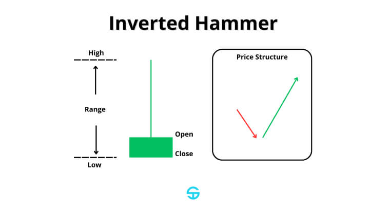
The inverted hammer is a single-candlestick pattern that also forms at the end of a downtrend. It consists of a small body at the lower end of its trading range and a long upper shadow, with little to no presence of a lower shadow.
The psychology behind this pattern also lies behind a struggle between bullish and bearish forces during the trading day. Buyers attempt to push the price higher–resulting in a long upper shadow.–but then sellers are able to drive the price back to its lowest levels. This candle indicates that buyers are testing the willpower of sellers, and momentum is shifting from bearish to bullish. If the second candle right after the inverted hammer is yet another bullish candle, reaching higher highs or closing levels, then we have enough bullish confirmation to indicate that the bear market is approaching its end.
Studies indicate that the inverted hammer has a success rate of 55-60%. It also works best when found at relevant support levels and when backed up by additional indications that the bear momentum has been exhausted.
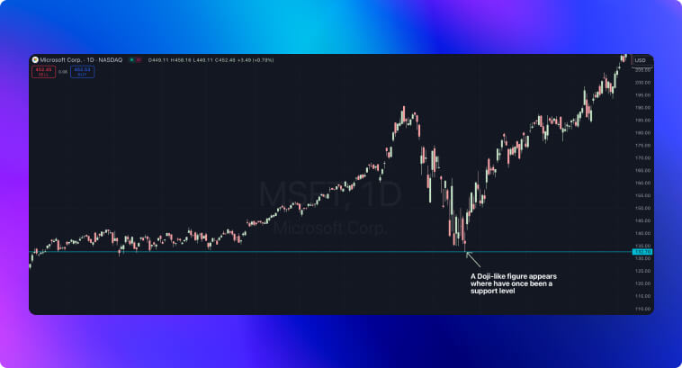
Doji
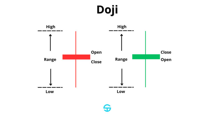
A Doji candlestick is categorized by open and close prices that are narrowly close to each other, which results in a very small candlestick body or even none at all–when the session closes at the same price level it opened. This type of candlestick represents deep indecision in the market, with prices bouncing up and down during the session. Even though it is not inherently bullish or bearish, a pattern like the Doji appearing after a downtrend can indicate that selling pressure may be weakening and a potential bullish reversal could be approaching.
The psychology imprinted onto the chart by the Doji reflects a balance of strength between buyers and sellers. After a series of bearish candles, the Doji indicates that market participants may be hesitant about pushing prices even lower. It means that the downward momentum is losing strength, and some people are starting to buy the asset, believing it to be under oversold levels–or even short-sellers taking their profits.
The effectiveness of a Doji, approximately 50-55%, according to some studies, tends to increase when confirmed by a second candlestick that closes higher than the Doji’s maximum price. You should always look for bullish confirmation coming from the next sessions whenever an individual candlestick forms patterns like the Doji. The more bullish confirmation, the higher the chances of an uptrend emerging.
Double Candlestick Patterns
Bullish Engulfing
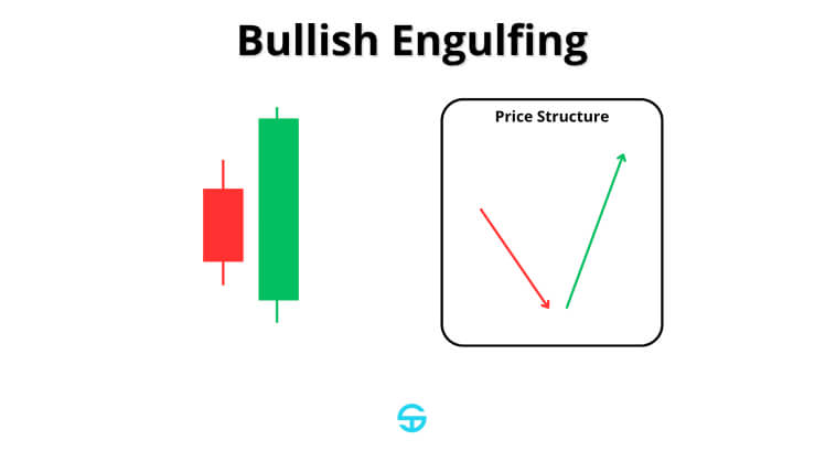
The bullish engulfing pattern consists of a large bullish candle that fully engulfs the body of the previous bearish candle. This two-candlestick formation is one of the most powerful patterns that traders can use to identify the end of a bearish trend and the start of an uptrend.
The first candlestick comes from a downtrend that reflects the dominance of sellers, as indicated by the initial bearish candle in the pattern. The next candlestick, however, reflects a huge shift in market sentiment. Bulls start to regain control, driving the price significantly higher and engulfing the entire range of the previous session.
The large bullish candlestick not only tells us that the selling pressure is weakening but also demonstrates that buyers are gaining dominance quite fast. When confirmed by high volume and additional bullish indicators, this pattern is regarded as a bullish reversal signal–and one with high effectiveness, reaching an accuracy rate of 60-70%, according to some studies.
Piercing Line
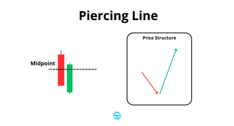
The piercing line pattern is a two-candlestick formation that often appears at bullish reversals at the bottom of a downtrend. It begins with a bearish candlestick that is then followed by a bullish candle that opens below the previous low but closes above the midpoint of the first candle. This long, bullish candlestick pattern shows even more strength when it appears at relevant support levels.
Studies suggest that the piercing line has a success rate of approximately 60-65%, being among the most reliable patterns that indicate an opportunity to get into trend reversals.
Harami
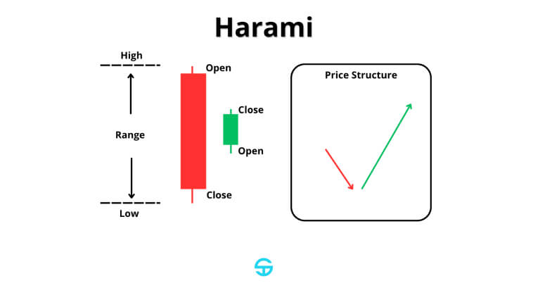
The harami pattern is another two-candlestick formation that is often considered a strong bullish indicator. It is characterized by a large bearish candle followed by a smaller bullish candle that stays within the entire range of the first one. This pattern serves as a powerful indicator of a shift in momentum because the smaller second candle reflects the surge in optimism from bulls since the market opens at a much higher level than the previous closing level. The harami pattern is definitely one of the most important patterns to know for getting early into new trends.
This pattern has an accuracy rate of around 55-60%. It becomes even more reliable when combined with some extra bullish signs, such as an increase in volume.
Triple Candlestick Patterns
Morning Star
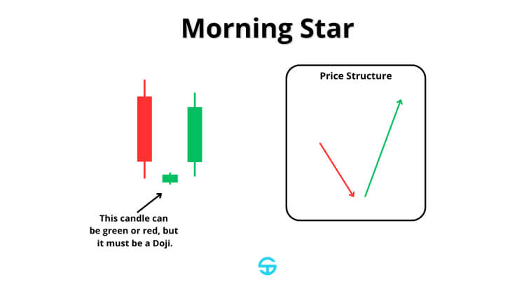
The Morning Star pattern is a three-candle formation that precedes a bullish reversal. This pattern visually starts with a bearish candle, coming from a sequence of bears’ dominance in driving prices down. The second candle is a small-bodied candlestick that opens way lower than the previous close, usually indicating indecisiveness. The third candle is bullish and shows that buyers are now stepping in with a surge in strength. Even though bears had market dominance, the small candle illustrates the exhaustion of that dominance, making bulls gain more confidence to push prices back up.
Some studies suggest that this reversal pattern has an accuracy rate of around 53%, making it moderately reliable in identifying trend reversals from bullish to bearish. Of course, with more indicators that bulls are gaining force, the more reliable the pattern becomes.
Three White Soldiers
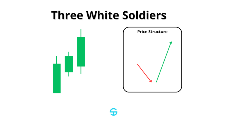
The Three White Soldiers pattern is made of three bullish candles with progressively higher closes, which indicates a strong market shift into buyer dominance. Each new candle reinforces how confident bulls are in bringing prices back up, enhancing the momentum, and pressuring people into buying more. This is effective in squeezing short-sellers, making them close their positions.
Some studies indicate that the Three White Soldiers pattern has an accuracy rate of 82%. As with all the other patterns, you must seek confirmation from surging trading volume. A pattern formation near strong support levels also increases its strength.
Other Complex Bullish Patterns to Know
Bullish Harami Cross
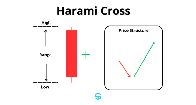
The Bullish Harami Cross pattern is very similar to the typical Bullish Harami pattern. The main difference is that the larger bearish candle is followed by a Doji.
Even though the bearish candle indicates that bears are in control of the price, the Doji indicates that the market reached a point of large equilibrium between sellers and buyers. This pattern often forms during downtrends. The Doji indicates some short-sellers are taking profits, whereas buyers are starting to add to the momentum to drive prices higher.
According to some studies, the Harami Cross pattern can have an accuracy rate of up to 60-65%, putting it among one of the most reliable patterns used to predict trend reversals.
Tweezer Bottoms
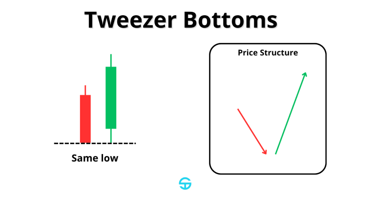
The Tweezer Bottom pattern consists of two consecutive candles with opposite colors and the exact same lowest price. This pattern indicates that a support level has been found at the micro level, giving buyers the confidence to enter long positions.
Psychologically speaking, Tweezer Bottoms imply that prices have reached a level where people are not so confident in selling, while buyers might believe that the asset is under oversold conditions, so they start buying. This pattern has deep roots in supply and demand theory.
This pattern can reach an accuracy rate of approximately 50-55%, and it tends to be more reliable when it appears in key support levels. It is also recommended to watch for the sizes of the candles involved, as two candles of similar sizes indicate equilibrium, meaning that bears don’t have the upper hand compared to bulls anymore.
Additional Candlestick Patterns
Besides typical formations like the hammer, the hanging man, and doji, there are other important formations that you must know. Flag pattern trading, for example, is among the most commonly used strategies by traders and investors worldwide as a continuation pattern. Differently from the patterns we’ve explored above, patterns like the flag pattern appear during a brief consolidation period before the trend continues. During a bull run, for example, a flag shows a brief pause in the race as some buyers take profits. The market is so strong, however, that this isn’t enough to bring prices down, so a breakout of the previous high eventually occurs and the trend continues.
A major difference between flag patterns and individual candlestick patterns like the doji lies in their formation period. A doji reflects indecision in a single session, which indicates hesitation and the possibility of a trend reversal. On the other hand, patterns like the flag pattern or head and shoulders take multiple sessions to develop. While single candlestick patterns reflect immediate market sentiment, flag patterns tend to be more structural, and they require a confirmation from a breakout before entering the trade. In the case of a flag pattern, the breakout happens when prices close above the top of the flagpole.
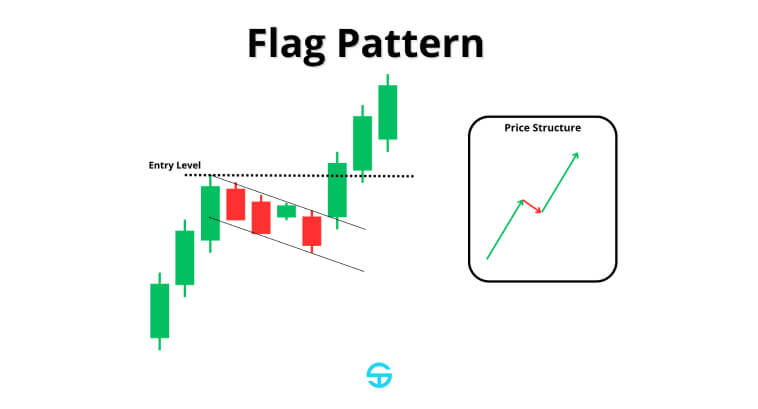
The image below depicts a textbook bullish flag pattern formed during an uptrend on the Bitcoin price chart on a daily timeframe. Prices are moving high, reflecting the buying interest from market participants until a point where it consolidates into a tight price range. This consolidation forms a horizontal channel–a flag!
Psychologically speaking, what happens here is that some buyers might be taking their profits, but the buying strength remains so strong that it doesn’t bring prices down. As soon as we have a large candle breaking out the flag and closing at its highest point, the bullish trend resumes into a strong rally.
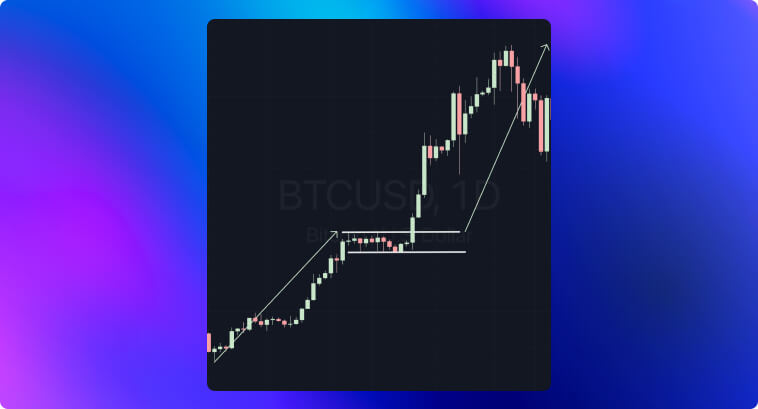
It is also interesting to notice how the first rally starts with the formation of a hammer at the bottom of the image, showing how all these patterns complete each other and give us a broader context into market sentiment.
Practical Application and Peculiarities of Reading Candlestick Patterns
To improve your chances of success, you must be able to understand the overall context in which a candlestick pattern appears.
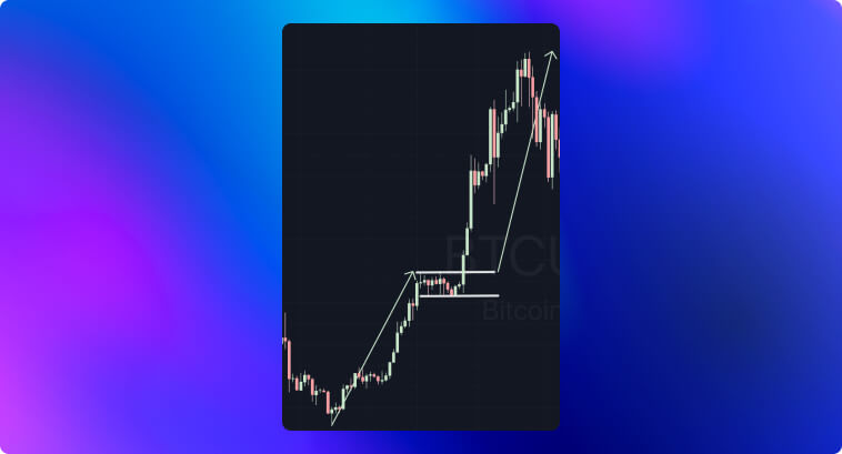
Patterns like the hammer or piercing line have way more significance when they appear after a clear downtrend, with prices in a steep decline. If we don’t have this movement, the reversal signal may not be very reliable. Hammers, for example, may appear at any point in a price chart–they’re actually quite common–but they will only hold the importance of a hammer pattern in a trending market. The Hammer from our previous Bitcoin example appeared right after a decline in prices. Even though the third candle inside the flag also resembles a hammer, it doesn’t hold the same power due to it appearing within a sideways market.
Do not rely only on candlestick patterns. Seek to understand the psychology behind the formation of each candle. The size, proportions, and gaps in candlesticks all hold extremely valuable data into how buyers and sellers are driving prices. Long lower shadows on hammers tell us there has been a strong rejection of lower price levels, whereas large bodies in bullish engulfings show how strong the buying pressure and confidence are. Gaps are also able to accurately reflect a sudden and strong shift in market sentiment, demonstrating that bulls can drive prices higher due to a strong demand for the asset.
It is important to remember that these patterns are only reliable when they are backed up by strong volume, which confirms large participation behind the price action that led to the formation of the pattern. Without enough trading volume, candlestick patterns can only serve as an indicator of low liquidity or temporary enthusiasm that doesn’t have enough strength to transform into a trend.
Improving Reliability and Confidence
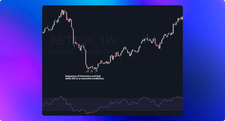
To improve your conditions of finding more reliable candlestick patterns, you must employ additional indicators and methods to filter out false signals. Indicators like moving averages and RSI are extremely efficient in providing additional context to confirm price signals. Observe how Netflix presented a sequence of Hammers and a Doji at a point where the RSI indicated prices were under oversold levels in the weekly chart.
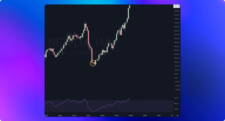
Zooming out, we can see yet another textbook hammer on the monthly chart, while the RSI is also approaching oversold levels. Candlestick patterns hold different weights in different timeframes. A pattern like the Hammer on a key support level with RSI around 30 has much more predicting power than the same pattern on a 5-minute chart. That’s because long-term investors and people focusing on swing trading strategies put a lot more confidence in these patterns, making them open larger positions to ride the trend reversal in the long term.
Integrating candlestick pattern trading with additional tools is a must. If you don’t do that, you will eventually end up falling for false signals. Regardless of whether you prefer using technical indicators or if you’re a heavy user of trendline strategies, errors in trading patterns often come from neglecting the overall context and placing way too much importance on the candlestick pattern alone.
Developing a Trading System Based on Bullish Reversal Patterns
To help you apply candlestick patterns to your skillset, I developed two step-by-step algorithms. The first one focuses on the development of your own trading system for bullish candlestick patterns. The second algorithm approaches how to avoid some common mistakes.
An Algorithm to Develop Your Trading System
1 – Identify the Main Market Context
- Make sure that the pattern appears under the appropriate conditions. A downtrend must exist so that a bullish reversal pattern can emerge (tip: use moving averages to confirm the main trend)
2 – Analyze the Chart for Pattern Formation
- Look for a clear bullish pattern such as the Hammer, Morning Star, or Bullish Engulfing
- Always take the proportions into account. Shadows and body size give you a lot of insights into the strength of the pattern
3 – Confirm With Indicators
- Use the RSI to identify oversold conditions
- You can also use the MACD indicator to look for price-indicator divergences
- Always include volume analysis in your trading system. Higher volume strengthens the reliability of the pattern
4 – Determine Entry and Exit Points
- The entry point can be right above the high of the bullish pattern
- The stop loss can be right below the pattern (for instance, right under the shadow of a hammer figure)
- You can define take-profit levels using resistance zones, Fibonacci retracements, or even specific measurements. For flag patterns, for example, the take-profit target tends to be the length of the flagpole.
5 – Risk Management
- Only risk a small percentage of capital per trade, no more than 2%
- You can adjust position sizes based on the reliability of the pattern. Patterns with higher accuracy, like the Bullish Engulfing, can be traded with larger sizes.
6 – Monitoring and Optimization
- Use trailing stops to protect your profits as the price keeps moving in your favor
- Keep a trade journal with details of each pattern you encountered, their entry and exit points, as well as the outcome of each trade
- Use Key Performance Indicators to assess how successful your trades are.
- Focus on patterns that have proven to be highly successful. Drop patterns that have been causing more losses than profits
- Test different markets and timeframes. Candlestick patterns tend to be more relevant on longer timeframes–daily, weekly, monthly–but if you’re trading highly volatile assets like cryptocurrencies or if you’re a day trader, then you should leverage backtesting or other algorithmic trading strategies to empower your trading system further.
An Algorithm to Avoid Common Mistakes
1 – Filter Out False Signals
- Always use volume as a validation tool. There is no point in entering trades when the pattern comes with low-volume
- Always use indicators like the RSI, MACD, or Bollinger Bands to confirm market sentiment
- Ignore any pattern that is formed during low liquidity periods like after-hours or in small-cap stocks
2 – Beware of Timeframe Peculiarities
- Don’t be so confident in lower-timeframe patterns, as these are way more prone to noise
- More reliable signals appear on daily, weekly, and monthly timeframes
- If you decide to day trade, then adjust the strategy for shorter timeframes. Quicker exits and tight stop-losses
3 – Other Common Mistakes
- Don’t trade patterns in isolation–always use at least a volume indicator.
- Avoid weak patterns (i.e., hammers with short shadows)
- Keep track of your emotions. Do not chase trades and avoid overleveraging on a single setup
Conclusion
Ever since the beginning of candlestick analysis, bullish patterns have been used as powerful indicators of shifts in market sentiment. Widely-known patterns like the Hammer, Morning Star, and Bullish Engulfing can tell us a lot about buyers’ and sellers’ emotions in an intuitive way. These symbols, although simple, contain valuable information about the psychology of the players involved in the market.
To effectively use candlestick patterns, they must be applied as a part of a broader trading system that includes risk management, entry and exit plans, and other methods for filtering out false signals–think of oscillators and trendline analyses. Higher timeframes tend to be more reliable than shorter timeframes, so be careful not to chase trades on an intraday chart. Keep a trade journal for optimizations, focus on improving outcomes over time, and combine candlestick patterns with the tools you like so that you can position yourself for long-term success.