Japanese Candlestick Charts
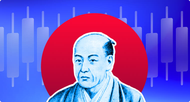
The origins of the Japanese Candlesticks date back to the 18th century. Munehisa Homma, a rice trader in Sakata, Japan, observed that the emotions of those involved in the rice market had a profound impact on price fluctuations. Homma understood that the psychology of traders influenced the market, making prices rise or fall based on emotions like greed and fear.
Through detailed analysis and observation, he registered the first candlestick patterns to track price action, and that allowed him to make decisions to predict future price movements. Munehisa published his findings in a book called The Fountain of God – The Three Monkey Record of Money. It is believed that, in today’s dollars, he was worth over $10 billion.
By the 1870s, Japanese candlesticks were already popular and widely adopted in the Japanese stock market. In the 1980s, the West was introduced to the candlestick methodology through the works of Steve Nison, who extensively researched and popularized this technique, making it an important aspect of modern-day technical analysis.
The Fundamentals of Japanese Candlesticks
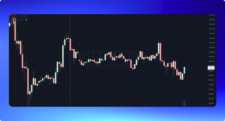
Candlestick charts are made of candles, representing price action over a certain period of time. Consider the 1-hour candlestick chart below for Bitcoin. Each candle represents what happened to the price in a 60-minute interval.
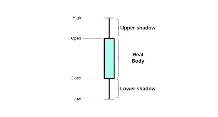
A candle has three key elements that translate price movement into our screens. These are:
- Body: The body represents the price range between the open and close prices. Its size reflects the momentum: long bodies indicate strong trends; short bodies indicate indecision between buyers and sellers.
- Shadows or Wicks: These lines extend above and below the body and mark the high and low prices for each interval. Their lengths can also highlight volatility. If a body has a large upper shadow plus a large lower shadow, it indicates that bulls and bears have been able to move prices towards both directions–an indication of a tight fight between them.
- Colors: They can be black and white, green and red, or whatever color you choose. These colors help us quickly identify market sentiment. Red/Black colors represent bearish price action (bears have been able to make the candle close below its opening); green/white represent bullish price action (bulls took the closing price above the opening price).
The image above depicts a bearish candle, suggesting that we had a downtrend within the period reflected in that candle. Here, the closing price is below the opening price, indicating that selling momentum has been stronger than buying momentum.
Indicators of Strength in Japanese Candlesticks
Before touching on candlestick patterns and strategies, it is important to understand how candlesticks imprint the psychology of the market onto the charts.
Each element of a candlestick signals the balance of power between buyers and sellers, giving us insights into the momentum and emotions driving the market.
- Long Bodies: Indicate strong buying or selling pressure. Suggest we had an uptrend or downtrend inside the period captured by that specific candle (5 minutes, 1 hour, 1 day, 1 week, etc.)
- Short Bodies: They indicate indecision or a balance of power. Neither buyers nor sellers could win the main trend of that period.
- Long Shadows: Reflect a surge in volatility. Both buyers and sellers had a “turf war” to bring the price up and down.
I have illustrated some examples below to show how we can assess trend momentum by looking at candlesticks alone. In the first image, we have a bullish candlestick with a large body and the absence of a lower shadow, meaning that the opening price was at the bottom of the period. Bulls have displayed total control of the market during the formation of this candle.
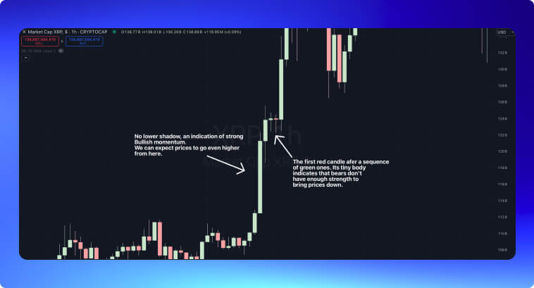
This candle then leads prices to an uptrend. After a while, a bearish candlestick appears. It has an extremely tiny body with a long pair of shadows. This indicates that bears have no strength in this market. Traders use this as a sign to buy when prices move above the upper shadow of this candle. The next candle displays a continuation pattern; it consists of a large green candle, indicating bulls will move prices even higher.
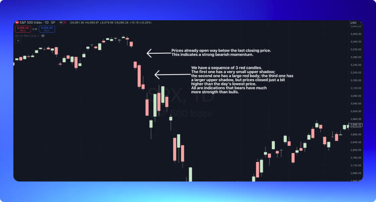
The example below shows the opposite. During the panic caused by the 2020 pandemic, markets opened with a large gap–when the opening price of a candle is way below the lower price of the previous candle. This gap was then followed by three red candles. The first candle has a very small upper shadow, indicating bulls have no strength to bring prices back up; the second candle consists of a large red body, whereas the third one has a longer upper shadow, but bears won the day by making prices close just a bit higher than the day’s lowest price.
Why Should I Use Japanese Candlestick Patterns in Technical Analysis?
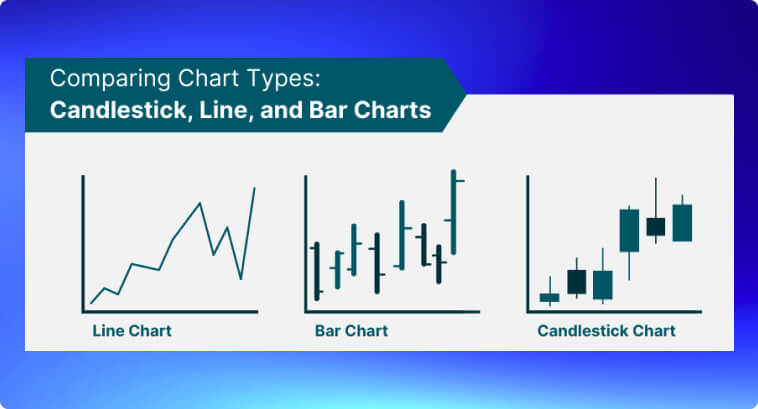
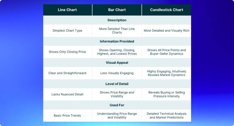
Compared to bar charts, candlestick charts offer an easier visualization of price information, allowing you to asses market psychology more quickly. A candlestick shows not only the high and low but also the open and close prices, making it a more detailed representation of trading activity within the timeframe.
The visual clarity of candlesticks can easily help you identify reversal points at the end of a downtrend or the end of an uptrend, for example. Given that these patterns represent the emotions of traders, they also help you by revealing whether the market sentiment is bullish or bearish. Unlike bar charts, candlesticks can describe a much richer narrative of price action, allowing you to make trading decisions more intuitively and confirm market trends or reversals more effectively.
Japanese Candlestick Patterns
Candlestick patterns offer a very straightforward solution to analyzing market trends and assessing price action. At the end of the day, these candlesticks are deeply rooted in the psychology behind supply and demand.
Once you know enough about candlestick patterns, you will find it easier to identify potential reversals or continuations of trends, improving your trading decision-making.
Below, we have some of the most basic and commonly used candlestick patterns, categorized by their structure and significance.
Dominate Price Charts: Basic Candlestick Patterns
Single Patterns
Hammer: The hammer is a bullish reversal pattern with a small body and a long lower shadow. This pattern usually appears at the bottom of a downtrend, indicating that although sellers were able to drive the price lower, strong buying pressure pushed it back up near its opening level.
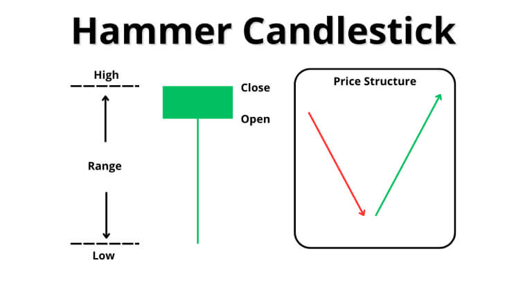
Studies show that the hammer pattern has an effectiveness rate of approximately 60-65% in predicting trend reversals, especially when followed by confirmation from subsequent candlesticks.
Hanging Man: The Hanging Man is the bearish counterpart of the hammer. It happens at the end of an uptrend. It features a small body and a long lower shadow.
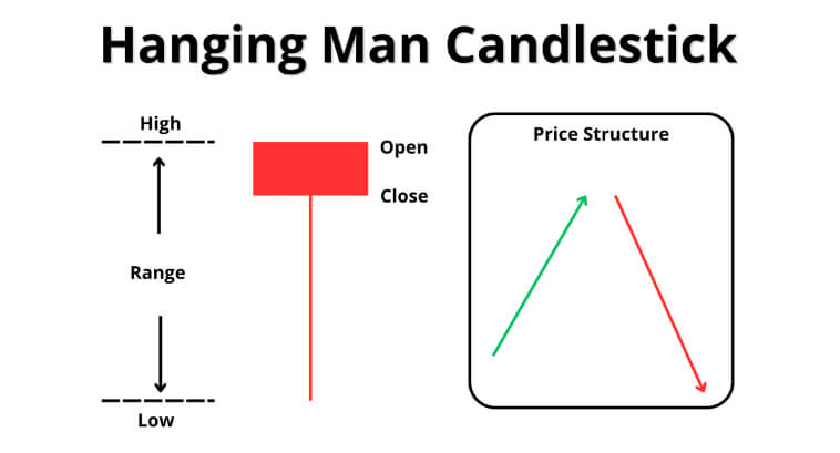
Studies indicate that the hanging man pattern has an effectiveness rate of approximately 55-60% in predicting trend reversals when validated by extra bearish signals.
Shooting Star: The Shooting Star is also a bearish reversal pattern. It features a small body and a long upper shadow, usually appearing at the end of an uptrend. The pattern indicates that, although buyers were able to push prices higher during the session, they were overwhelmed by sellers before the close.
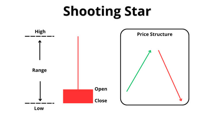
Studies indicate that the shooting star pattern can have an effectiveness rate of up to 65% in predicting trend reversals, especially when followed by confirmation from subsequent bearish candlesticks.
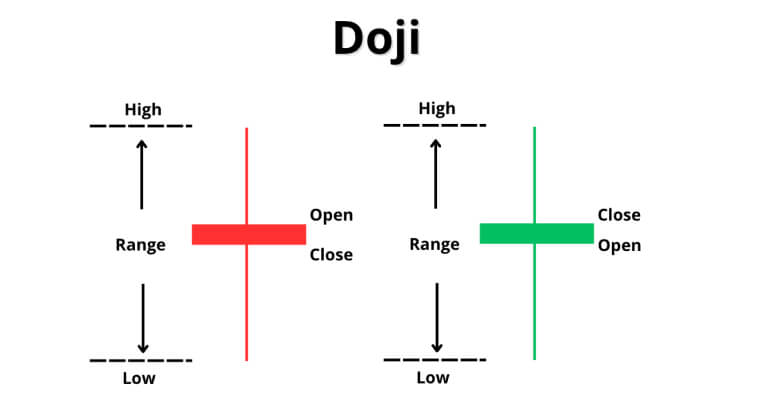
Doji: This is a neutral pattern that indicates indecision, where the open and close prices are narrowly close to each other. It often indicates a potential reversal or continuation depending on its placement within the trend, as well as the accompanying volume.
Double Patterns
Harami: This pattern consists of a small candlestick within the range of the previous larger candle. A Bullish Harami indicates a potential trend reversal in a downtrend, whereas a Bearish Harami is an indicator of a reversal in an uptrend. This pattern reflects a weakening of the momentum of the current trend.
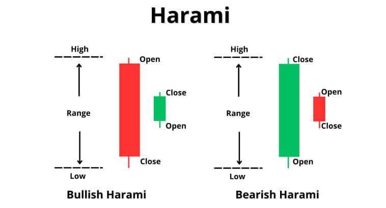
According to some studies, the Harami pattern has an effectiveness rate of approximately 52-58%.
Engulfing: The Engulfing pattern shows a candlestick that completely engulfs the previous one. A Bullish Engulfing pattern indicates a reversal at the end of a downtrend, with buyers overpowering the sellers. A Bearish Engulfing, on the other hand, appears at the end of an uptrend, indicating that bears have now taken control of prices.
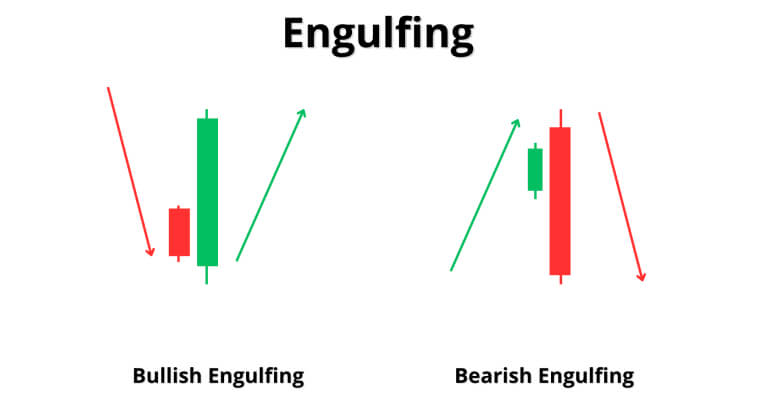
The Bullish Engulfing pattern has a success rate of roughly 62% in capturing trend reversals, whereas the Bearish Engulfing reaches an impressive 82% success rate, according to some studies.
Dark Cloud Cover: The Dark Cloud Cover is a bearish reversal pattern that occurs at the top of an uptrend. It consists of a large bullish candlestick that is then followed by a bearish candlestick that opens above the previous day’s high but closes below the midpoint of the previous bullish candle. This pattern is effective in identifying trend reversals because it reflects the strong selling pressure that emerges in an uptrend.

Overall, it is believed that the Dark Cloud Cover has an effectiveness rate of 60-63% in accurately predicting bearish reversals.
Piercing Line: This pattern is the bullish counterpart to the Dark Cloud Cover pattern. It happens when a bullish candle closes above the midpoint of the previous bearish candlestick. This pattern also reflects a strong buying interest in the asset in question, making it a good predictor of trend reversal from a downtrend to an uptrend.
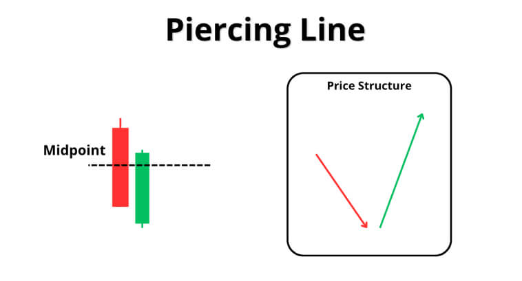
Research indicates that the Piercing Line can be effective at around 64-72% of the time it appears on a Candlestick chart.
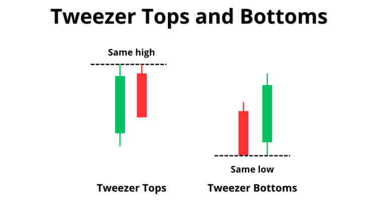
Tweezer Tops and Bottoms: These patterns can indicate trend reversals on both bullish and bearish trends. The Tweezer Top pattern happens when two consecutive candles have the same highs/tops. The Tweezer Bottom pattern happens when two consecutive candles have the same lows/bottoms.
Triple Patterns
Morning Star: The Morning Star pattern is a bullish reversal pattern that is made of three candlesticks: a long bearish candle, followed by a short-bodied candle, and a long bullish candle. This pattern can accurately reflect a transition from bearish to bullish momentum and tends to show up at the bottom of a downtrend.
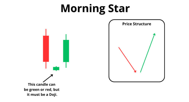
The Morning Star pattern has an accuracy rate of 65-70%, according to some studies. Its accuracy score has a tendency to get higher when the pattern is accompanied by other indicators of a trend reversal.
Evening Star: This is the bearish version of the Morning Star pattern. It consists of a long bullish candle, followed by a small-bodied candle, and a long bearish candle.
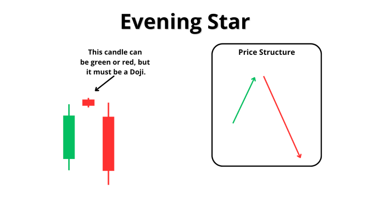
The Evening Star can have an accuracy rate of 71% in predicting bearish reversal, according to some sources.
Three White Soldiers: This pattern is a bullish reversal pattern that often appears after a decline in prices. It captures the market sentiment shift from bearish to bullish. It consists of three bullish candles, illustrating the strong buying pressure exercised on price.
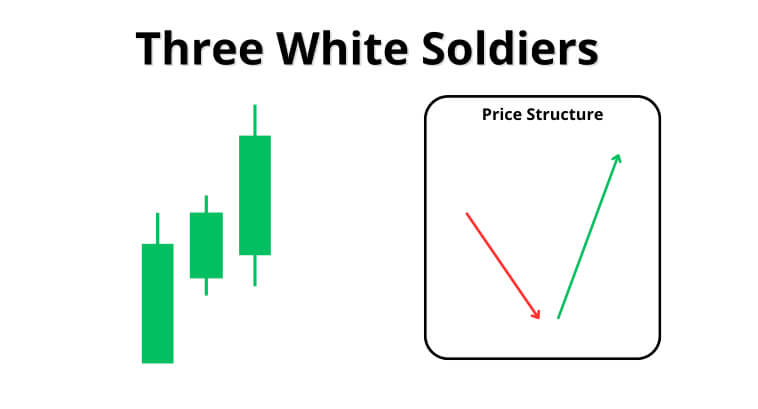
This pattern is considered one of the most reliable reversal patterns, with studies indicating a success rate of 82%–an impressive number.
Three Black Crows: This is the bearish version of the Three White Soldiers. It consists of three long, bearish candles that appear right next to each other after an uptrend. It tends to be very effective in markets with high liquidity and clear trends. It also captures the strong shift in sentiment from bullish to bearish.
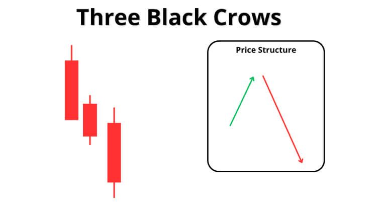
It has a success rate of 78%, according to some studies, with its accuracy getting better when it is accompanied by additional indicators that a trend reversal is imminent.
Abandoned Baby: The abandoned baby is a rare reversal candlestick. Although not very frequent, it is a powerful pattern in capturing change in market sentiment.
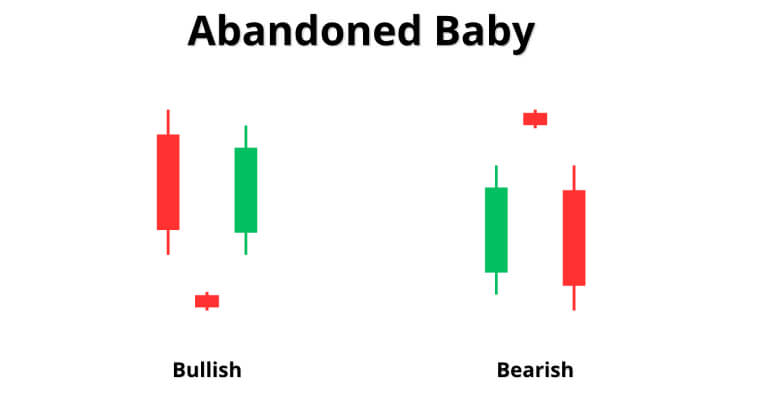
It is formed by a large first candle that is aligned with the prevailing trend. A Doji then gaps away from the first candle, and a third candle then gaps in the opposite direction of the trend, which indicates that the opposite side of the trend started to gain strength.
This pattern is uncommon, but most see it as a reliable pattern in predicting trend reversals. Studies suggest that it has an accuracy rate of 81%.
Three Inside Up and Down: This is a three-candlestick pattern that indicates trend reversal. In a bullish scenario, a bearish candlestick is followed by a smaller bullish candle that stays within the range of the first, and a third bullish candle closes above the first candle’s high. The bearish version of this pattern follows the same logic but reverses the process.
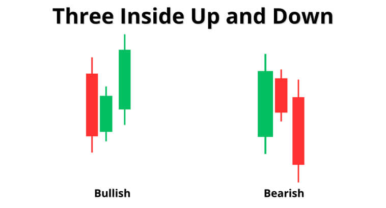
According to some sources, this pattern has an accuracy rate of 65%. It is more reliable when it appears at important support or resistance levels.
Detecting Trends with Candlesticks
Candlestick Combinations
You can always identify trends and reversals by analyzing multiple candles in succession–this is the idea behind Candlestick chart patterns.
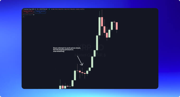
A sequence of long green candlesticks with minimal shadows is a strong indicator of strong upward momentum. Take the example of the recent bull run in XRP in the image below. We have several bullish candles with long bodies and small shadows right next to each other. In a scenario like this, bears have no chance of bringing prices down.
Although we can use candlesticks to guide us through price action, with patterns like the bearish engulfing pattern, we should always consider additional tools to provide us with a broader context of the market. It’s always a good idea to wait for confirmation from additional candlesticks or other technical indicators before acting.
Some techniques have been invented to give a higher interpretability to candlesticks.
The Heikin-Ashi Technique
The Heikin-Ashi chart is based on a method that smooths price swings, The idea here is to filter out the noise and make trends easier to identify. Below, we have a daily picture of the S&P 500 with regular Candlesticks.
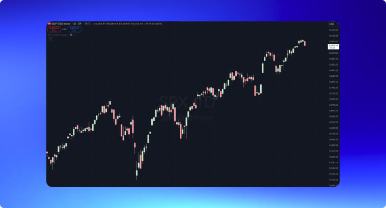
On the other hand, the image below depicts the exact same time window, but instead of candlesticks, we have Heikin-Ashi.
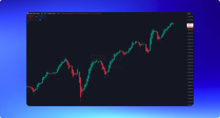
As you can see in the graph above, the Heinkin-Ashi chart makes it much easier to spot trends and assess their strength. A long sequence of green candles indicates strong bullish momentum, whereas red candles indicate that bears are moving prices. The absence of shadows in the opposite direction of a candle confirms the trend’s strength.
Calculating Heikin-Ashi
Here’s how we calculate Heikin-Ashi:
- Open = (Previous Heikin-Ashi Open + Previous Heikin-Ashi Close) / 2
- Close = (Open + High + Low + Close) /4
- High = The highest value among the High, Heikin-Ashi Open, and Heikin-Ashi Close
- Low = The lowest value among the Low, Heikin-Ashi Open, and Heikin-Ashi Close.
For beginners, the Heikin-Ashi method can offer a simplified way of identifying trends and leaving out all unnecessary market noise. By looking at a sequence of large green or red candles, beginners can stay in profitable positions longer and avoid premature exits due to all the noise that comes from daily price swings.
Still, this technique also has its own set of pitfalls. It does lag behind a regular candlestick chart, meaning it reacts slower to sudden reversals or market shifts. If you want to find good entry points and are interested in trend-reversal strategies, I wouldn’t suggest using Heikin-Ashi. But if you’re already positioned and don’t want to close the trade too soon, then monitoring price via a Heikin-Ashi chart might be a good strategy to avoid being influenced by all the noise in a regular candlestick chart.
Practical Application
Optimal Timeframes
Both traders and investors might use the candlesticks for assessing market trends, finding entry points, taking profits, and setting stop losses. These tools are so versatile that they can be adapted to different timeframes, from intraday to long-term time windows.
Each timeframe will provide insights that can be useful for different trading styles and strategies. Intraday charts often have a lot of noise and increased volatility, but that can be useful for day traders and scalpers who look for quick price swings.
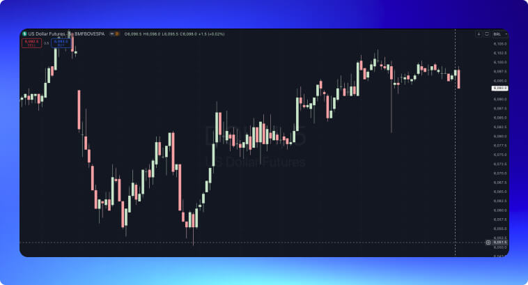
The image below depicts a 5-minute chart of Dollar futures in the Brazilian market. The large shadows on the candles can be a paradise for scalpers who know how to make money on volatility.
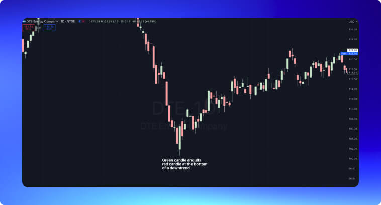
On the other hand, candlestick patterns tend to be more reliable when they happen over a longer timeframe, like daily, weekly, or monthly. In the image below, we have prices declining fast on a daily chart until a green candle engulfs the entire body of the previous red candle. This gave way to an uptrend that, although not as intensive as the previous downtrend, still was able to bring prices back up.
Combining Candlestick Patterns With Indicators.
My preferred way of using candlestick patterns is by combining them with technical indicators. When you see a reversal pattern forming, it is always a good idea to check if it makes sense to enter a trade in the direction of the reversal. Let’s introduce an RSI to the chart above.
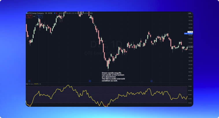
The RSI shows us that prices were under oversold conditions, giving even more confidence to open a long position after the engulfing pattern.
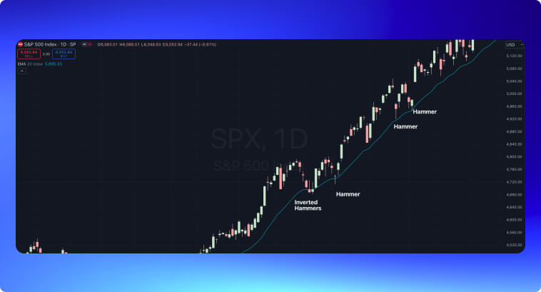
Moving averages also provide insights into entry positions. You can adapt the logic of buying hammers and inverse hammers when they form at the end of a downtrend to buying hammers when they form around a moving average in an uptrend. This allows you to buy the pullback and ride a strong trend. The moving average–in this specific condition–serves as a moving support zone, where the formation of a pattern is often relevant for future price movements.
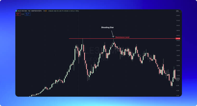
Drawing support and resistance levels, as well as trendlines, can also be useful when candlesticks form patterns. In the example below, we have a shooting star around the same price level as the previous peak. The failure to break above the last peak is a strong suggestion that bulls don’t have enough strength to make a higher high.
Peculiarities of Different Instruments
Candlestick patterns are effective in identifying the continuation or reversal of trends across different instruments, from Forex to Commodities and Crypto. Each has its own peculiarities, of course.
- Forex Market: If you already know how to read Forex charts, then you know that in these markets, candlestick patterns will often reflect fast price changes. These markets have higher volatility and are more prone to the influence of macroeconomic events and breaking news. Not only do you have to react quickly, but you also have to use additional tools to confirm signals before acting. This is where it gets helpful to add technical indicators alongside chart patterns or even employ some algorithmic trading strategies to your skillset.
- Commodities Market: Commodities very often display seasonal patterns that can enhance the reliability of the information about price movements that come from candlestick patterns, especially when you combine them with the knowledge of supply and demand cycles. During the harvest season, prices may become more predictable based on the increase in supply, which candlestick patterns like the hammer or engulfing can help confirm.
- Cryptocurrency Market: Cryptocurrencies–like Forex–are known for being highly volatile. It is a good idea to evaluate long-term candles to confirm any signal you encounter. Another good strategy is using the trading volume as a confirmation tool.
The Importance of Trading Volume
Volume is probably the most important indicator to look at when analyzing candlestick patterns. Observe how the Bullish Engulfing below was accompanied by a surge in trading volume.
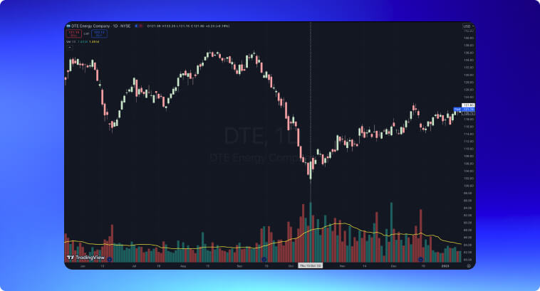
Looking at the trading volume is important because it reflects the pressure exercised in the price during the formation of that single candlestick pattern. Patterns, including either bullish or bearish engulfing or the three white soldiers and three black crows, become more significant with high-intensity volume, as it is the volume that reflects market pressure on price movements.
Pitfalls to Avoid
The main pitfalls to avoid as a beginner are:
- Misinterpreting signals by reading patterns in isolation without considering the broader context. Try to understand why a pattern happened. Was it an unexpected event? Breaking news?
- Not paying enough attention to timeframes. Candlestick patterns on short-period timeframes can be unreliable. When looking at a 5-minute or 15-minute chart, a lot of noise comes up. If you’re day trading, ensure to also look at longer-period charts to improve your decision-making process.
- Neglecting volume is a terrible mistake. Candlesticks are not only formed by price within a timeframe but also by volume. When a pattern appears, but there is not enough volume to back it up, it tends to be unreliable.
- Overtrading by misplacing confidence in candlestick patterns alone can lead you to terrible losses–use additional indicators, confirm the patterns you see with additional candles, and don’t let greed take the best of you.
Closing Arguments
From the Japanese rice markets to the 1980s Wall Street, candlestick analysis is still one of the most versatile and effective tools to employ as a trader. You can adapt them to different market scenarios, financial instruments, and trading styles. Besides that, today’s markets also provide you with conditions to easily integrate automated alerts into real-time analysis, something that is pretty easy to do with Candlestick patterns and allows you to quickly respond to emerging price action. Automation not only diminishes risks but also enhances the accuracy of your entries.
Candlestick analysis serves as a bridge between market psychology and insights into price action. With it, you can identify trend reversals, ride trends more effectively, and develop strategies and automation tools that are better suited for each financial instrument and market conditions.
This is, beyond a reasonable doubt, a timeless method for understanding financial markets. You can easily enjoy the best opportunities the markets have to offer by understanding how and why these patterns are formed and by leveraging them to your favor.